Welcome to a quick tutorial on how to show error messages in HTML forms. This is probably one of the major bugbears for some beginners, how do we handle and show error messages for HTML forms?
There are no fixed ways to show errors in HTML forms, but the common methods to display error messages are:
- Simply add checking attributes to the HTML form fields, and the browser will automatically show the errors. For example,
<input type="text" required> - Use Javascript to show custom error messages as the user types in the fields.
- Collectively show all error messages in a popup box when the user submits an invalid form.
- Show error messages below the invalid fields.
That covers the broad basics, let us walk through detailed examples in this guide – Read on!
ⓘ I have included a zip file with all the source code at the start of this tutorial, so you don’t have to copy-paste everything… Or if you just want to dive straight in.
TABLE OF CONTENTS
DOWNLOAD & NOTES

Firstly, here is the download link to the example code as promised.
QUICK NOTES
If you spot a bug, feel free to comment below. I try to answer short questions too, but it is one person versus the entire world… If you need answers urgently, please check out my list of websites to get help with programming.
EXAMPLE CODE DOWNLOAD
Click here to download all the example source code, I have released it under the MIT license, so feel free to build on top of it or use it in your own project.
DISPLAY ERROR MESSAGES

All right, let us now get into the various examples of displaying error messages in an HTML form.
EXAMPLE 1) DEFAULT ERROR DISPLAY
1-default.html
<form onsubmit="return false;">
<label for="fname">Name</label>
<input type="text" name="fname" id="fname" required minlength="2" maxlength="8">
<label for="fnumber">Number</label>
<input type="number" name="fnumber" id="fnumber" min="1" max="12">
<label for="fyes">Enter "Yes"</label>
<input type="text" name="fyes" id="fyes" required pattern="Yes">
<input type="submit" value="Go!">
</form>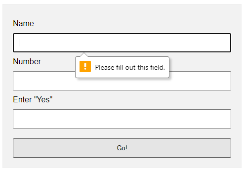 Oh no, displaying error messages is SO DIFFICULT! Not. Just add the form checking attributes to the fields:
requiredSelf-explanatory. A required field that cannot be left blank.min-length max-lengthThe minimum and maximum number of characters allowed.min maxFor number fields only, the minimum and maximum allowed values.patternThis field must match the custom pattern. Will leave a link in the extras section below if you want to learn more.
Yes, that’s all. The browser will do the rest of the magic.
EXAMPLE 2) SHOW ERRORS AS-YOU-TYPE
2-type.html
<!-- (A) HTML FORM -->
<form onsubmit="return false;">
<label for="fname">Name</label>
<input type="text" name="fname" id="fname" required minlength="2" maxlength="8">
<input type="submit" value="Go!">
</form>
<!-- (B) SET CUSTOM ERROR MESSAGE -->
<script>
var fname = document.getElementById("fname");
fname.addEventListener("input", () => {
if (fname.validity.tooLong || fname.validity.tooShort || fname.validity.valueMissing) {
fname.setCustomValidity("Name must be 2-8 characters.");
fname.reportValidity();
} else { fname.setCustomValidity(""); }
});
</script>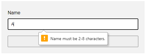 This one is a little naggy and requires some Javascript. A couple of functions and properties to take note of here:
document.getElementById("ID")Get element by ID. Captain Obvious.FIELD.addEventListener("input", FUNCTION)Run this function whenever the user types something in the field.FIELD.validity.tooLong FIELD.validity.tooShort FIELD.validity.valueMissingWe can actually target various invalid statuses and show different messages. Will leave a link in the extras section below to the full list.FIELD.setCustomValidity("MESSAGE")andFIELD.reportValidity()Show custom error message.
EXAMPLE 3) DISPLAY ERROR MESSAGES IN POPUP
3-alert.html
<!-- (A) HTML FORM -->
<form onsubmit="return check()" novalidate>
  <label for="fname">Name</label>
  <input type="text" name="fname" id="fname" required minlength="2" maxlength="8">

  <label for="fnumber">Number</label>
  <input type="number" name="fnumber" id="fnumber" required min="1" max="12">

  <input type="submit" value="Go!">
</form>

<!-- (B) FORM CHECK -->
<script>
function check () {
  // (B1) INIT
  var error = "", field = "";

  // (B2) NAME
  field = document.getElementById("fname");
  if (!field.checkValidity()) {
    error += "Name must be 2-4 characters\r\n";
  }

  // (B3) NUMBER
  field = document.getElementById("fnumber");
  if (!field.checkValidity()) {
    error += "Num must be between 1-12\r\n";
  }

  // (B4) RESULT
  if (error=="") { return true; }
  else {
    alert(error);
    return false;
  }
}
</script>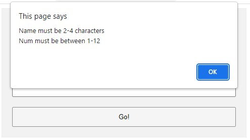
The less naggy method, where all the error messages are compiled into a single popup. Take note:
- A
novalidatehas been added to the<form>tag. This disables the default browser form checking, and we do our own in Javascript usingonsubmit="return check()". - The Javascript is pretty long-winded but straightforward.
- Use
var error = ""to collect all the error messages. - Fetch the field we want to check
field = document.getElementById("ID"). - Add a message if it is invalid
if (!field.checkValidity()) { error += "ERROR"; } - That’s all, repeat the check for all fields.
- Lastly, show the error message if not empty and don’t allow the form submission
if (error !="") { alert(error); return false; }
- Use
EXAMPLE 4) SHOW ERROR MESSAGE UNDER FIELD
4-below.html
<!-- (A) SOME SIMPLE ERROR STYLES -->
<style>
.err { background: #ffe6ee; border: 1px solid #b1395f; }
.emsg { color: #c12020; font-weight: bold; }
</style>
<!-- (B) HTML FORM -->
<form onsubmit="return check()" novalidate>
<label for="fname">Name</label>
<input type="text" name="fname" id="fname" required minlength="2" maxlength="8">
<div id="cname" class="emsg"></div>
<label for="fnumber">Number</label>
<input type="number" name="fnumber" id="fnumber" required min="1" max="12">
<div id="cnumber" class="emsg"></div>
<input type="submit" value="Go!">
</form>
<!-- (C) FORM CHECK -->
<script>
function check () {
// (C1) INIT
var valid = true, error = "", field = "";
// (C2) NAME
field = document.getElementById("fname");
error = document.getElementById("cname");
if (!field.checkValidity()) {
valid = false;
field.classList.add("err");
error.innerHTML = "Name must be 2-4 characters\r\n";
} else {
field.classList.remove("err");
error.innerHTML = "";
}
// (C3) NUMBER
field = document.getElementById("fnumber");
error = document.getElementById("cnumber");
if (!field.checkValidity()) {
valid = false;
field.classList.add("err");
error.innerHTML = "Num must be between 1-12\r\n";
} else {
field.classList.remove("err");
error.innerHTML = "";
}
// (C4) RESULT
return valid;
}
</script>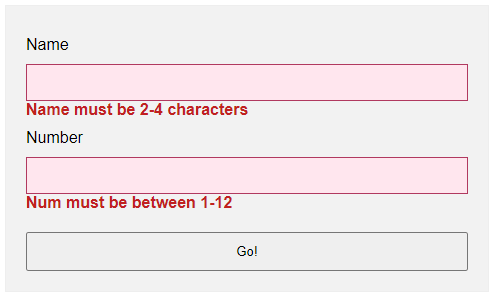 Lastly, this is pretty much similar to the popup example.
- Use
novalidateandonsubmitto do our own customization. - But instead of showing in a popup, we attach a
<div class="emsg">below all fields. - On an invalid input, we show the error message in the
<div>instead.
LINKS & REFERENCES
- HTML Pattern – MDN
- Validity State – MDN
- Form Validation – MDN
- HTML Form Validation Without Javascript – Code Boxx
THE END

Thank you for reading, and we have come to the end. I hope that it has helped you to better understand, and if you want to share anything with this guide, please feel free to comment below. Good luck and happy coding!
For show an error message below this it if a user puts some wrong value inside that field, yes you are talking about showing validation errors. There are two types of these validation error messages available in HTML 5:
- Automatic messages
- Custom messages
Automatic Messages
Automatic messages simply use HTML5 form attributes. But the disadvantage is they are automatic, not customizable by default. For example if you require an email, the default error message on Firefox, when you specify an email input and fail to write one: Please enter an email address, you would not be able to change this using just HTML and CSS.
Another disadvantage is the default message depends on the browser locale, so if for example you are borrowing your friend’s French computer to view an English website, those default error messages will then display in French:

Source: Mozilla Developer Network article: Data form validation
Custom messages
As Data form validation says:
To customize the appearance and text of these messages, you must use JavaScript; there is no way to do it using just HTML and CSS.
HTML5 provides the constraint validation API to check and customize the state of a form element.
The example from Data form validation:
<form>
  <label for="mail">I would like you to provide me an e-mail</label>
  <input type="email" id="mail" name="mail">
  <button>Submit</button>
</form>
var email = document.getElementById("mail");

email.addEventListener("keyup", function (event) {
  if (email.validity.typeMismatch) {
    email.setCustomValidity("I expect an e-mail, darling!");
  } else {
    email.setCustomValidity("");
  }
});
So yes, you can have messages below the input in HTML5. Just beware that they will either be the automatic type, or, to customize, you need to look into using the constraint validation API to write your own messages using JavaScript.
Ни для кого не секрет, что онлайн-формы могут стать серьёзным испытанием для пользователей. Особенно когда они выглядят как список полей для ввода без каких-либо подсказок. Однако мы, как разработчики, можем значительно облегчить жизнь посетителям наших сайтов.
Используем CSS
В CSS существует четыре специальных псевдокласса, применимых к полям формы: :valid (валидное поле), :invalid (невалидное), :required (обязательное) и :optional (необязательное). Их можно использовать, чтобы добавлять некоторые — хотя и весьма ограниченные — подсказки пользователям, заполняющим форму.
Используя :valid и :invalid, мы можем показать пользователю, правильно ли заполнено поле по мере ввода.
input:valid {
  border-color: green;
}

input:invalid {
  border-color: red;
}
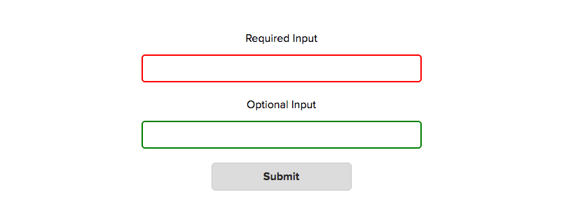
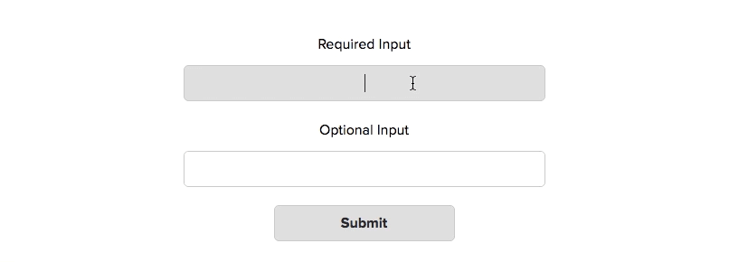
Однако с этим способом связана одна проблема: стили применяются до того, как пользователь начнёт работу с формой. Поля, обязательные для заполнения, сразу подсветятся нам как :invalid, а необязательные — как :valid. Это значит, что пользователь, даже не приступив к заполнению формы, может сразу же получить негативную обратную связь. Не очень-то хорошо.
Стилизация состояний :required и :optional сама по себе не особо полезна, поскольку эта информация обычно указывается в подписях к полям формы. Однако мы можем объединить эти состояния с псевдоклассами :valid / :invalid и стилизовать их комбинации. Например, мы хотим показывать лишь положительный результат, когда валидно обязательное к заполнению поле.
input:required:valid {
  border-color: green;
}
Используем JavaScript
JavaScript даёт намного больше возможностей для улучшения работы пользователей с формами. Давайте рассмотрим в качестве примера три числовых поля, у каждого из которых установлен минимум в 10, максимум в 100 и шаг в 10 единиц.
<form>
  <label>
    Number Input 1
   <input type="number" min="10" max="100" step="10">
  </label>

  <label>
    Number Input 2
   <input type="number" min="10" max="100" step="10">
  </label>

  <label>
    Number Input 3
   <input type="number" min="10" max="100" step="10">
  </label>

  <input type="submit">
</form>
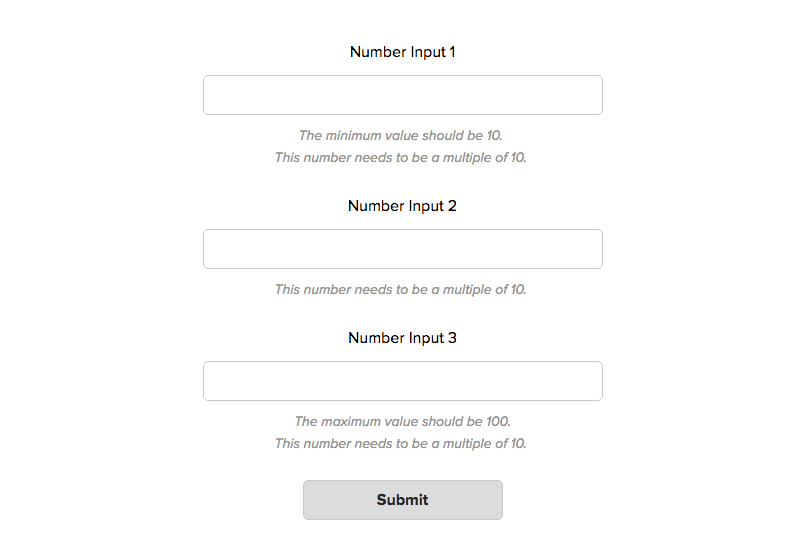
Устанавливая атрибуты min, max и step, мы можем быть уверены в правильности значения только тогда, когда пользователь использует специальные контролы числового поля. Но что мешает пользователю ввести вручную некорректные данные? Вот что произойдёт, если он вставит 1, 12 и 123 в три поля и отправит форму:
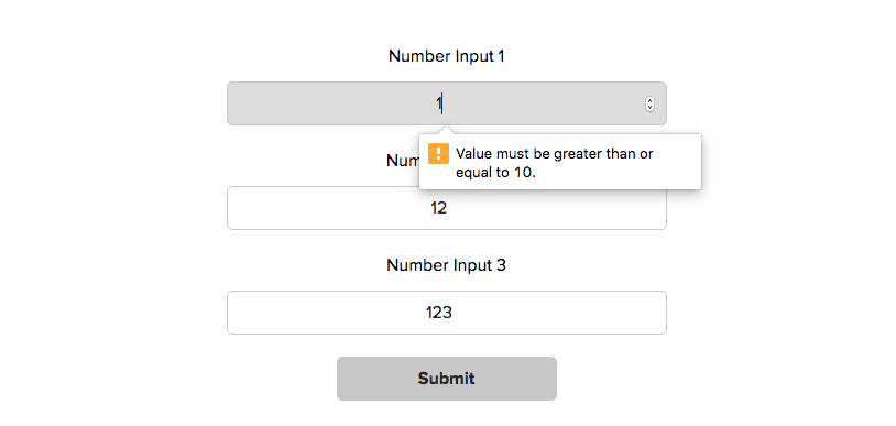
В результате всё, что получит пользователь — это сообщение об ошибке для первого поля. Кроме того, в этом сообщении будет указано лишь одно несоответствие из двух требуемых. Такое поведение можно исправить, изменяя показываемые валидатором сообщения.
Добавляем несколько сообщений об ошибках в один тултип
Валидируя поля, браузер проверяет их по определённому списку потенциальных ошибок. В каждом поле содержится специальный объект validity, включающий в себя список булевых значений, характеризующих ту или иную проверку на валидность. Например, вот такой validity-объект будет у поля, когда пользователь введёт в него 1:
input.validity = {
  valid: false // Поле валидно
  customError: false // Установленно специальное сообщение ошибки
  patternMismatch: false // Значение не удовлетворяет шаблону, установленному в атрибуте pattern
  rangeOverflow: false // Значение превосходит атрибут max
  rangeUnderflow: true // Значение меньше атрибута min
  stepMismatch: true // Значение не соответствует указаному шагу
  tooLong: false // Значение слишком длинное
  tooShort: false // Значение слишком короткое
  typeMismatch: false // Значение не соответствует указаному атрибуту type
  valueMissing: false // Отсутствует обязательное значение
};
Примечание переводчика: Слово «mismatch» переводится как «несоответствие». Поэтому в значениях patternMismatch, stepMismatch и typeMismatch обратная логика: true — значение не удовлетворяет атрибуту, false — удовлетворяет.
По умолчанию браузер отобразит лишь одну ошибку. Что мы можем сделать, так это проверить все эти значения самостоятельно и, если найдутся ошибки, сохранить их. Как только мы сохраним все ошибки для одного поля, мы можем отобразить весь их список в виде специального сообщения об ошибке при помощи функции setCustomValidity().
function CustomValidation() { }

CustomValidation.prototype = {
  // Установим пустой массив сообщений об ошибках
  invalidities: [],

  // Метод, проверяющий валидность
  checkValidity: function(input) {

    var validity = input.validity;

    if (validity.patternMismatch) {
      this.addInvalidity('This is the wrong pattern for this field');
    }

    if (validity.rangeOverflow) {
      var max = getAttributeValue(input, 'max');
      this.addInvalidity('The maximum value should be ' + max);
    }

    if (validity.rangeUnderflow) {
      var min = getAttributeValue(input, 'min');
      this.addInvalidity('The minimum value should be ' + min);
    }

    if (validity.stepMismatch) {
      var step = getAttributeValue(input, 'step');
      this.addInvalidity('This number needs to be a multiple of ' + step);
    }

    // И остальные проверки валидности...
  },

  // Добавляем сообщение об ошибке в массив ошибок
  addInvalidity: function(message) {
    this.invalidities.push(message);
  },

  // Получаем общий текст сообщений об ошибках
  getInvalidities: function() {
    return this.invalidities.join('. \n');
  }
};

// Добавляем обработчик клика на кнопку отправки формы
submit.addEventListener('click', function(e) {
  // Пройдёмся по всем полям
  for (var i = 0; i < inputs.length; i++) {

    var input = inputs[i];

    // Проверим валидность поля, используя встроенную в JavaScript функцию checkValidity()
    if (input.checkValidity() == false) {

      var inputCustomValidation = new CustomValidation(); // Создадим объект CustomValidation
      inputCustomValidation.checkValidity(input); // Выявим ошибки
      var customValidityMessage = inputCustomValidation.getInvalidities(); // Получим все сообщения об ошибках
      input.setCustomValidity(customValidityMessage); // Установим специальное сообщение об ошибке

    } // закончился if
  } // закончился цикл
});
Теперь при попытке отправить форму мы увидим вот это:
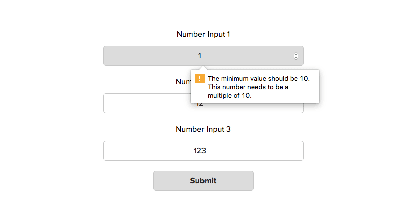
Отображаем несколько ошибок в одном тултипе
Стало лучше, поскольку теперь будут показываться все сообщения об ошибках, связанные с конкретным полем. Однако другая проблема всё ещё не решена: ошибки по-прежнему показываются лишь для первого поля.
Это ограничение валидации, устанавливаемое браузером. Чтобы его побороть, нам нужно пойти другим путём.
Показываем все ошибки для всех полей
Вместо того, чтобы использовать встроенный тултип, мы можем добавлять сообщения об ошибках напрямую в DOM. Таким образом, все ошибки будут выводиться рядом с соответствующим полем.
Этого можно добиться какой-то парой дополнительных строчек в нашем коде:
CustomValidation.prototype.getInvaliditiesForHTML = function() {
  return this.invalidities.join('. <br>');
}

// Добавляем обработчик клика на кнопку отправки формы
submit.addEventListener('click', function(e) {
  // Пройдёмся по всем полям
  for (var i = 0; i < inputs.length; i++) {

    var input = inputs[i];

    // Проверим валидность поля, используя встроенную в JavaScript функцию checkValidity()
    if (input.checkValidity() == false) {

      var inputCustomValidation = new CustomValidation(); // Создадим объект CustomValidation
      inputCustomValidation.checkValidity(input); // Выявим ошибки
      var customValidityMessage = inputCustomValidation.getInvalidities(); // Получим все сообщения об ошибках
      input.setCustomValidity(customValidityMessage); // Установим специальное сообщение об ошибке

      // Добавим ошибки в документ
      var customValidityMessageForHTML = inputCustomValidation.getInvaliditiesForHTML();
      input.insertAdjacentHTML('afterend', '<p class="error-message">' + customValidityMessageForHTML + '</p>')
      stopSubmit = true;

    } // закончился if
  } // закончился цикл

  if (stopSubmit) {
    e.preventDefault();
  }
});
Вот что происходит при клике на submit теперь:
Используем нестандартные проверки валидности
Иногда встроенной в браузер валидации бывает недостаточно. Нам может понадобиться, чтобы вводимые данные удовлетворяли некоторым дополнительным правилам. Например, чтобы в текстовом поле требовалось указать особые символы.
Так как мы уже проверяем все возможные ошибки вручную в нашей функции CustomValidation.prototype.checkValidity, мы можем просто-напросто добавить туда ещё несколько проверок.
CustomValidation.prototype.checkValidity = function(input) {

  // Тут идут встроенные проверки валидности

  // А тут специальные
  if (!input.value.match(/[a-z]/g)) {
    this.addInvalidity('At least 1 lowercase letter is required');
  }

  if (!input.value.match(/[A-Z]/g)) {
    this.addInvalidity('At least 1 uppercase letter is required');
  }
};
Валидация в реальном времени
Хотя текущий способ выглядит намного лучше, он тоже не без изъянов. Наихудший из недочётов заключается в том, что пользователь не сможет увидеть никаких сообщений, пока не нажмёт на кнопку отправки формы. Было бы гораздо лучше, если бы валидация поля происходила сразу же при его заполнении. Можно выделить три правила для того, чтобы с формой было удобно работать:
- Требования для каждого поля чётко видны до того, как пользователь начал печатать.
- Как только пользователь начинает вводить данные, соблюдая требования, он сразу видит индикатор успешного заполнения поля или подсказки, если есть ошибки.
- Нужно отображать сообщения об ошибках таким образом, чтобы пользователь не мог отправить некорректно заполненную форму.
Если вы хотите попробовать свои силы (и даже сделать получше), вы можете воспользоваться вот этим шаблоном.
«Доктайп» — журнал о фронтенде. Читайте, слушайте и учитесь с нами.
ТелеграмПодкастБесплатные учебники
This tutorial will show you how to create and customize error messaging for various form elements. In this tutorial, we will customize everything from a basic error message to input field errors and tooltips. The best part? We will be using only CSS for customizations – that means no images or javascript required!
HTML
Below is the markup for the form elements we will be creating error messaging for. This is all of the HTML used throughout this tutorial. Copy and paste this code into your working file:
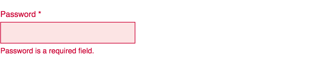
<!-- Basic Error Message -->
<div class="error-message">
  <span class="error-text">Checkout could not be completed. Please check your login information and try again.</span>
</div>

<!-- Input Field Error -->
<div class="input-group error">
  <label>Password *</label>
  <input type="text">
  <div class="error-message">Password is a required field.</div>
</div>

<!-- Input Field Error with Tooltip -->
<div class="input-group error">
  <label>Quantity</label>
  <input type="text">
  <div class="error-tip">Enter a quantity</div>
</div>
CSS
Now onto my personal favorite: the CSS. We will keep the basic functionality of the form elements but completely customize their appearance. In the end, they will stand on their own as custom design elements that thoughtfully guide the user through the form process, making it as straightforward and painless as possible.
Basic Error Message
Let’s start with a basic error message. We are going to customize the HTML above to look like this:
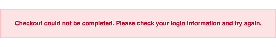
This is what we start out with, by default, after adding the HTML:

Customizing a basic error message is really simple. All we have to do is give our text a colored background and a couple font styles using CSS. To style the error message background, add the following styles to your CSS stylesheet:
.error-message {
  background-color: #fce4e4;
  border: 1px solid #fcc2c3;
  float: left;
  padding: 20px 30px;
}
Now let’s style the text itself by adding the following font styles:
.error-text {
  color: #cc0033;
  font-family: Helvetica, Arial, sans-serif;
  font-size: 13px;
  font-weight: bold;
  line-height: 20px;
  text-shadow: 1px 1px rgba(250,250,250,.3);
}
That’s it! Keep reading to learn how to style input field and tooltip errors.
Input Field Error
Now that we have our basic error message styled, let’s work on input field errors. This is what the final product will look like:
And this is what we start out with by default:

First, we want to override the browser’s default styles. Add the following CSS to give your input field a custom look:
/* Basic Input Styling */
.input-group {
  color: #333;
  float: left;
  font-family: Helvetica, Arial, sans-serif;
  font-size: 13px;
  line-height: 20px;
  margin: 0 20px 10px;
  width: 200px;
}

label {
  display: block;
  margin-bottom: 2px;
}

input[type=text] {
  background: #fff;
  border: 1px solid #999;
  float: left;
  font-size: 13px;
  height: 33px;
  margin: 0;
  padding: 0 0 0 15px;
  width: 100%;
}
Next, we need to add the styling for the error message that displays when a user does not correctly fill out an input field (i.e. the “This is a required field” message):
.error-message {
  color: #cc0033;
  display: inline-block;
  font-size: 12px;
  line-height: 15px;
  margin: 5px 0 0;
}
Lastly, add the error-specific styling for the input field elements:
.error label {
  color: #cc0033;
}

.error input[type=text] {
  background-color: #fce4e4;
  border: 1px solid #cc0033;
  outline: none;
}
Input Field Error with Tooltip
The last element we’re tackling is the tooltip. It is slightly more complicated than the others but well worth the effort. We will also be utilizing Sass nesting to better organize our code, and because we are only using SCSS it is 100% editable and scalable.
Once we are done, the tooltip will look like this:

And by default, this is what we start with after adding the HTML:

First, we override the browser’s default styles with our own custom styling:
/* Basic Input Styling */
.input-group {
  color: #333;
  float: left;
  font-family: Helvetica, Arial, sans-serif;
  font-size: 13px;
  line-height: 20px;
  margin-bottom: 10px;
  width: 100%;
}

label {
  display: block;
  margin-bottom: 5px;
}

input[type=text] {
  background: #fff;
  border: 1px solid #ccc;
  color: #333;
  float: left;
  font-family: Helvetica, Arial, sans-serif;
  font-size: 13px;
  height: 33px;
  line-height: 20px;
  margin: 0;
  padding: 0 0 0 15px;
  width: 45px;
}
Just like our previous example, we need to add the tooltip error message styling that displays when a form error occurs. Note: we are using Sass here to nest the tooltip’s left arrow properties. This comes in handy when trying to keep track of which values are assigned to the tooltip specifically:
/* Tooltip Styling */
.error-tip {
  background-color: #fce4e4;
  border: 1px solid #fcc2c3;
  border-radius: 7px;
  -moz-border-radius: 7px;
  -webkit-border-radius: 7px;
  display: inline;
  color: #cc0033;
  float: left;
  font-weight: bold;
  line-height: 24px;
  position: relative;
  padding: 7px 11px 4px;
  margin-left: 17px;
  // Left Arrow Styling Starts Here
  &:after, &:before {
    content: '';
    border: 7px solid transparent;
    position: absolute;
    top: 11px;
  }
  &:after {
    border-right: 7px solid #fce4e4;
    left: -14px;
  }
  &:before {
    border-right: 7px solid #fcc2c3;
    left: -15px;
  }
} // end .error-tip
Now all that’s left to do is define the input’s error-specific styling. Again, we will nest these styles under an “error” class selector to make classification and future changes easier:
/* Error Styling */
.error.input-group {
  label {
    color: #cc0033;
    font-weight: bold;
  }
  input {
    border: 2px solid #cc0033;
    line-height: 37px;
    outline: none;
  }
  .status {
    display: none;
  }
  .error-tip {
    display: inline;
  }
} // end .error
And that’s it! All the code you need to customize error messaging for default form elements. To experiment with the final results and copy and paste to your heart’s content (without fear of breaking anything), jump on over to Codepen by selecting any of the tutorial links below.
Codepen/Tutorial Links
All: codepen.io/seskew/
Basic Error Message: codepen.io/seskew/pen/akhLx
Input Field Error: codepen.io/seskew/pen/XKJKNQ
Input Field Error with Tooltip: codepen.io/seskew/pen/NrPNBp

Forms are ubiquitous in web applications. Some apps use forms to collect data to sign up users and provide an email address. Others use them to fulfill online transactions to facilitate a shopping experience.
You might use some web forms to apply for a new car loan, whereas you’ll use others to order pizza for dinner. So it’s important that the data collected from those forms is cleaned, formatted correctly, and devoid of any malicious code. This process is called form validation.
We need form validation anytime we are accepting user input. We must ensure that the data entered is in the correct format, lies within a valid range of data (such as for date fields), and does not contain malicious code that could lead to SQL injections. Malformed or missing data can also cause the API to throw errors.
What are the different types of form validations?
Form validation can happen on the client side and the server side.
Client side validation occurs using HTML5 attributes and client side JavaScript.
You may have noticed that in some forms, as soon as you enter an invalid email address, the form gives an error «Please enter a valid email». This immediate type of validation is usually done via client side JavaScript.
In other cases, you may have noticed that when you fill out a form and enter details such as a credit card, it may show a loading screen and then show an error «This credit card is invalid».
Here, the form made a call to its server side code, and returned a validation error after performing additional credit card checks. This validation case where a server-side call is made is called server side validation.
What data should be validated?
Form validation is needed anytime you accept data from a user. This may include:
- Validating the format of fields such as email address, phone number, zip code, name, password.
- Validating mandatory fields
- Checking the type of data such as string vs number for fields such as social security number.
- Ensuring that the value entered is a valid value such as country, date, and so on.
How to set up client side validation
On the client side, validation can be done in two ways:
- Using HTML5 functionality
- Using JavaScript
How to set up validation with HTML5 functionality
HTML5 provides a bunch of attributes to help validate data. Here are some common validation cases:
- Making fields required using
required - Constraining the length of data:
minlength,maxlength: for text dataminandmaxfor max value of num type
- Restricting the type of data using
type:<input type="email" name="multiple>
- Specifying data patterns using
pattern:- specifies a regex pattern that the entered form data needs to match
When the input value matches the above HTML5 validation, it gets assigned a psuedo-class :valid, and :invalid if it doesn’t.
Let’s try an example:
<form>
<label for="firstname"> First Name: </label>
<input type="text" name="firstname" id="firstname" required maxlength="45">
<label for="lastname"> Last Name: </label>
<input type="text" name="lastname" id="lastname" required maxlength="45">
<button>Submit</button>
</form>
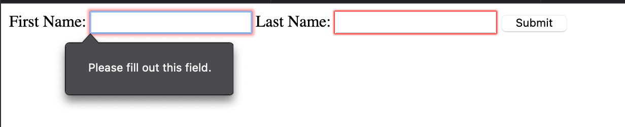
Link to JSFiddle
Here we have two required fields — First Name and Last Name. Try this example in JSFidle. If you skip either of these fields and press submit, you’ll get a message, «Please fill out this field». This is validation using in-built HTML5.
How to set up validation using JavaScript
When implementing form validation, there are a few things to consider:
- What is defined as «valid» data? This helps you answer questions about the format, length, required fields, and type of data.
- What happens when invalid data is entered? This will help you define the user experience of the validation — whether to show an error message inline or at the top of the form, how detailed should the error message be, should the form be sumitted anyways, should there be analytics to track invalid format of data? And so on.
You can perform JavaScript validation in two ways:
- Inline validation using JavaScript
- HTML5 Constraint validation API
Inline validation using JavaScript
<form id="form">
  <label for="firstname"> First Name* </label>
  <input type="text" name="firstname" id="firstname" />
  <button id="submit">Submit</button>

  <span role="alert" id="nameError" aria-hidden="true">
    Please enter First Name
  </span>
</form>
const submit = document.getElementById("submit");

submit.addEventListener("click", validate);

function validate(e) {
  e.preventDefault();

  const firstNameField = document.getElementById("firstname");
  let valid = true;

  if (!firstNameField.value) {
    const nameError = document.getElementById("nameError");
    nameError.classList.add("visible");
    firstNameField.classList.add("invalid");
    nameError.setAttribute("aria-hidden", false);
    nameError.setAttribute("aria-invalid", true);
  }
  return valid;
}
#nameError {
  display: none;
  font-size: 0.8em;
}

#nameError.visible {
  display: block;
}

input.invalid {
  border-color: red;
}
Link to JSFiddle
In this example, we check for required fields using JavaScript. If a required field is not present, we use CSS to show the error message.
Aria labels are modified accordingly to signal an error. By using CSS to show / hide an error, we are reducing the number of DOM manipulations we need to make. The error message is provided in-context thereby making the user experience intuitive.
HTML5 Constraint validation API
The required and pattern HTML attributes can help perform basic validation. But if you want more complex validation or want to provide detailed error messaging, you can use the Constraint Validation API.
Some methods provided by this API are:
checkValiditysetCustomValidityreportValidity
The following properties are useful:
validityvalidationMessagewillValidate
In this example, we will validate using HTML5 inbuilt methods such as required and length in conjunction with the Constraint Validation API to provide detailed error messages.
<form>
<label for="firstname"> First Name: </label>
<input type="text" name="firstname" required id="firstname">
<button>Submit</button>
</form>
const nameField = document.querySelector("input");

nameField.addEventListener("input", () => {
  nameField.setCustomValidity("");
  nameField.checkValidity();
  console.log(nameField.checkValidity());
});

nameField.addEventListener("invalid", () => {
  nameField.setCustomValidity("Please fill in your First Name.");
});
Link to JSFiddle
Don’t forget server side validation
Client side validation is not the only validation check you should do. You must also validate the data received from your client on the server side code to ensure that the data matches what you expect it to be.
You can also use server-side validation to perform business logic verifications that should not live on the client side.
Form Validation best practices
- Always have server side validation, since malicious actors can bypass client side validation.
- Provide detailed error messages in-context with the field that produced the error.
- Provide an example of what the data should look like in case of an error message, such as — «Email did not match format — test@example.com»
- Avoid using single error pages that involve redirection. This is bad user experience and forces the user to go back to a previous page to fix the form and lose context.
- Always mark required fields.
Interested in more tutorials and articles like this? Sign up for my newsletter. or follow me on Twitter
Learn to code for free. freeCodeCamp’s open source curriculum has helped more than 40,000 people get jobs as developers. Get started