Welcome to a quick tutorial on how to show error messages in HTML forms. This is probably one of the major bugbears for some beginners, how do we handle and show error messages for HTML forms?
There are no fixed ways to show errors in HTML forms, but the common methods to display error messages are:
- Simply add checking attributes to the HTML form fields, and the browser will automatically show the errors. For example,
<input type="text" required> - Use Javascript to show custom error messages as the user types in the fields.
- Collectively show all error messages in a popup box when the user submits an invalid form.
- Show error messages below the invalid fields.
That covers the broad basics, let us walk through detailed examples in this guide – Read on!
ⓘ I have included a zip file with all the source code at the start of this tutorial, so you don’t have to copy-paste everything… Or if you just want to dive straight in.
TABLE OF CONTENTS
DOWNLOAD & NOTES

Firstly, here is the download link to the example code as promised.
QUICK NOTES
If you spot a bug, feel free to comment below. I try to answer short questions too, but it is one person versus the entire world… If you need answers urgently, please check out my list of websites to get help with programming.
EXAMPLE CODE DOWNLOAD
Click here to download all the example source code, I have released it under the MIT license, so feel free to build on top of it or use it in your own project.
DISPLAY ERROR MESSAGES

All right, let us now get into the various examples of displaying error messages in an HTML form.
EXAMPLE 1) DEFAULT ERROR DISPLAY
1-default.html
<form onsubmit="return false;">
<label for="fname">Name</label>
<input type="text" name="fname" id="fname" required minlength="2" maxlength="8">
<label for="fnumber">Number</label>
<input type="number" name="fnumber" id="fnumber" min="1" max="12">
<label for="fyes">Enter "Yes"</label>
<input type="text" name="fyes" id="fyes" required pattern="Yes">
<input type="submit" value="Go!">
</form>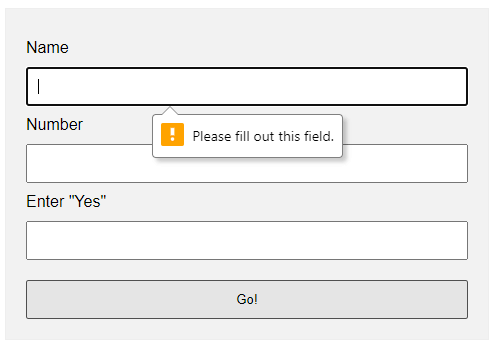 Oh no, displaying error messages is SO DIFFICULT! Not. Just add the form checking attributes to the fields:
requiredSelf-explanatory. A required field that cannot be left blank.min-length max-lengthThe minimum and maximum number of characters allowed.min maxFor number fields only, the minimum and maximum allowed values.patternThis field must match the custom pattern. Will leave a link in the extras section below if you want to learn more.
Yes, that’s all. The browser will do the rest of the magic.
EXAMPLE 2) SHOW ERRORS AS-YOU-TYPE
2-type.html
<!-- (A) HTML FORM -->
<form onsubmit="return false;">
<label for="fname">Name</label>
<input type="text" name="fname" id="fname" required minlength="2" maxlength="8">
<input type="submit" value="Go!">
</form>
<!-- (B) SET CUSTOM ERROR MESSAGE -->
<script>
var fname = document.getElementById("fname");
fname.addEventListener("input", () => {
if (fname.validity.tooLong || fname.validity.tooShort || fname.validity.valueMissing) {
fname.setCustomValidity("Name must be 2-8 characters.");
fname.reportValidity();
} else { fname.setCustomValidity(""); }
});
</script>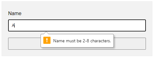 This one is a little naggy and requires some Javascript. A couple of functions and properties to take note of here:
document.getElementById("ID")Get element by ID. Captain Obvious.FIELD.addEventListener("input", FUNCTION)Run this function whenever the user types something in the field.FIELD.validity.tooLong FIELD.validity.tooShort FIELD.validity.valueMissingWe can actually target various invalid statuses and show different messages. Will leave a link in the extras section below to the full list.FIELD.setCustomValidity("MESSAGE")andFIELD.reportValidity()Show custom error message.
EXAMPLE 3) DISPLAY ERROR MESSAGES IN POPUP
3-alert.html
<!-- (A) HTML FORM -->
<form onsubmit="return check()" novalidate>
  <label for="fname">Name</label>
  <input type="text" name="fname" id="fname" required minlength="2" maxlength="8">

  <label for="fnumber">Number</label>
  <input type="number" name="fnumber" id="fnumber" required min="1" max="12">

  <input type="submit" value="Go!">
</form>

<!-- (B) FORM CHECK -->
<script>
function check () {
  // (B1) INIT
  var error = "", field = "";

  // (B2) NAME
  field = document.getElementById("fname");
  if (!field.checkValidity()) {
    error += "Name must be 2-4 characters\r\n";
  }

  // (B3) NUMBER
  field = document.getElementById("fnumber");
  if (!field.checkValidity()) {
    error += "Num must be between 1-12\r\n";
  }

  // (B4) RESULT
  if (error=="") { return true; }
  else {
    alert(error);
    return false;
  }
}
</script>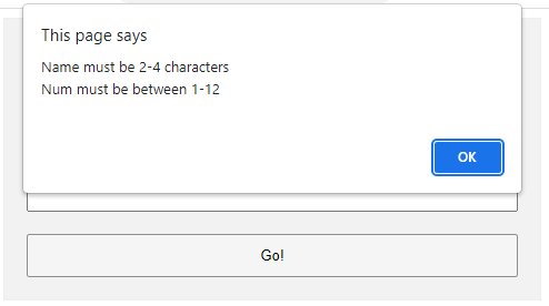
The less naggy method, where all the error messages are compiled into a single popup. Take note:
- A
novalidatehas been added to the<form>tag. This disables the default browser form checking, and we do our own in Javascript usingonsubmit="return check()". - The Javascript is pretty long-winded but straightforward.
- Use
var error = ""to collect all the error messages. - Fetch the field we want to check
field = document.getElementById("ID"). - Add a message if it is invalid
if (!field.checkValidity()) { error += "ERROR"; } - That’s all, repeat the check for all fields.
- Lastly, show the error message if not empty and don’t allow the form submission
if (error !="") { alert(error); return false; }
- Use
EXAMPLE 4) SHOW ERROR MESSAGE UNDER FIELD
4-below.html
 <!-- (A) SOME SIMPLE ERROR STYLES -->
<style>
.err { background: #ffe6ee; border: 1px solid #b1395f; }
.emsg { color: #c12020; font-weight: bold; }
</style>

<!-- (B) HTML FORM -->
<form onsubmit="return check()" novalidate>
  <label for="fname">Name</label>
  <input type="text" name="fname" id="fname" required minlength="2" maxlength="8">
  <div id="cname" class="emsg"></div>

  <label for="fnumber">Number</label>
  <input type="number" name="fnumber" id="fnumber" required min="1" max="12">
  <div id="cnumber" class="emsg"></div>

  <input type="submit" value="Go!">
</form>

<!-- (C) FORM CHECK -->
<script>
function check () {
  // (C1) INIT
  var valid = true, error = "", field = "";

  // (C2) NAME
  field = document.getElementById("fname");
  error = document.getElementById("cname");
  if (!field.checkValidity()) {
    valid = false;
    field.classList.add("err");
    error.innerHTML = "Name must be 2-4 characters\r\n";
  } else {
    field.classList.remove("err");
    error.innerHTML = "";
  }

  // (C3) NUMBER
  field = document.getElementById("fnumber");
  error = document.getElementById("cnumber");
  if (!field.checkValidity()) {
    valid = false;
    field.classList.add("err");
    error.innerHTML = "Num must be between 1-12\r\n";
  } else {
    field.classList.remove("err");
    error.innerHTML = "";
  }

  // (C4) RESULT
  return valid;
}
</script>
Lastly, this is pretty much similar to the popup example.
- Use
novalidateandonsubmitto do our own customization. - But instead of showing in a popup, we attach a
<div class="emsg">below all fields. - On an invalid input, we show the error message in the
<div>instead.
LINKS & REFERENCES
- HTML Pattern – MDN
- Validity State – MDN
- Form Validation – MDN
- HTML Form Validation Without Javascript – Code Boxx
THE END

Thank you for reading, and we have come to the end. I hope that it has helped you to better understand, and if you want to share anything with this guide, please feel free to comment below. Good luck and happy coding!
This tutorial will show you how to create and customize error messaging for various form elements. In this tutorial, we will customize everything from a basic error message to input field errors and tooltips. The best part? We will be using only CSS for customizations – that means no images or javascript required!
HTML
Below is the markup for the form elements we will be creating error messaging for. This is all of the HTML used throughout this tutorial. Copy and paste this code into your working file:
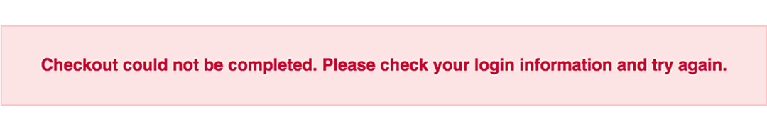
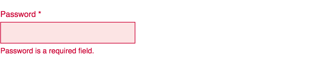
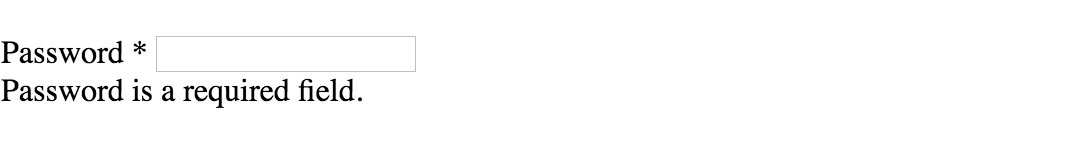
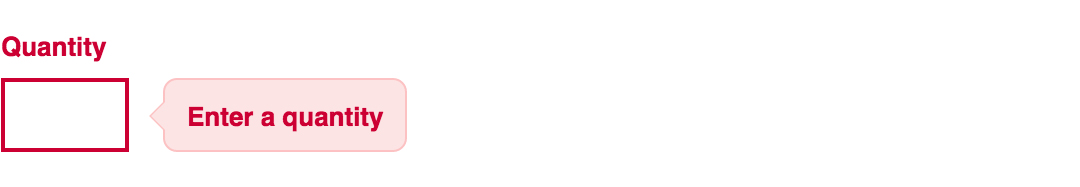
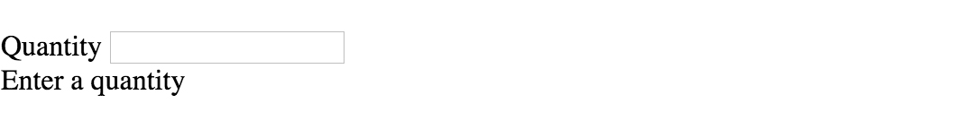
<!-- Basic Error Message -->
<div class="error-message">
  <span class="error-text">Checkout could not be completed. Please check your login information and try again.</span>
</div>

<!-- Input Field Error -->
<div class="input-group error">
  <label>Password *</label>
  <input type="text">
  <div class="error-message">Password is a required field.</div>
</div>

<!-- Input Field Error with Tooltip -->
<div class="input-group error">
  <label>Quantity</label>
  <input type="text">
  <div class="error-tip">Enter a quantity</div>
</div>
CSS
Now onto my personal favorite: the CSS. We will keep the basic functionality of the form elements but completely customize their appearance. In the end, they will stand on their own as custom design elements that thoughtfully guide the user through the form process, making it as straightforward and painless as possible.
Basic Error Message
Let’s start with a basic error message. We are going to customize the HTML above to look like this:
This is what we start out with, by default, after adding the HTML:

Customizing a basic error message is really simple. All we have to do is give our text a colored background and a couple font styles using CSS. To style the error message background, add the following styles to your CSS stylesheet:
.error-message {
  background-color: #fce4e4;
  border: 1px solid #fcc2c3;
  float: left;
  padding: 20px 30px;
}
Now let’s style the text itself by adding the following font styles:
.error-text {
  color: #cc0033;
  font-family: Helvetica, Arial, sans-serif;
  font-size: 13px;
  font-weight: bold;
  line-height: 20px;
  text-shadow: 1px 1px rgba(250,250,250,.3);
}
That’s it! Keep reading to learn how to style input field and tooltip errors.
Input Field Error
Now that we have our basic error message styled, let’s work on input field errors. This is what the final product will look like:
And this is what we start out with by default:
First, we want to override the browser’s default styles. Add the following CSS to give your input field a custom look:
/* Basic Input Styling */
.input-group {
  color: #333;
  float: left;
  font-family: Helvetica, Arial, sans-serif;
  font-size: 13px;
  line-height: 20px;
  margin: 0 20px 10px;
  width: 200px;
}

label {
  display: block;
  margin-bottom: 2px;
}

input[type=text] {
  background: #fff;
  border: 1px solid #999;
  float: left;
  font-size: 13px;
  height: 33px;
  margin: 0;
  padding: 0 0 0 15px;
  width: 100%;
}
Next, we need to add the styling for the error message that displays when a user does not correctly fill out an input field (i.e. the “This is a required field” message):
.error-message {
  color: #cc0033;
  display: inline-block;
  font-size: 12px;
  line-height: 15px;
  margin: 5px 0 0;
}
Lastly, add the error-specific styling for the input field elements:
.error label {
  color: #cc0033;
}

.error input[type=text] {
  background-color: #fce4e4;
  border: 1px solid #cc0033;
  outline: none;
}
Input Field Error with Tooltip
The last element we’re tackling is the tooltip. It is slightly more complicated than the others but well worth the effort. We will also be utilizing Sass nesting to better organize our code, and because we are only using SCSS it is 100% editable and scalable.
Once we are done, the tooltip will look like this:
And by default, this is what we start with after adding the HTML:
First, we override the browser’s default styles with our own custom styling:
/* Basic Input Styling */
.input-group {
  color: #333;
  float: left;
  font-family: Helvetica, Arial, sans-serif;
  font-size: 13px;
  line-height: 20px;
  margin-bottom: 10px;
  width: 100%;
}

label {
  display: block;
  margin-bottom: 5px;
}

input[type=text] {
  background: #fff;
  border: 1px solid #ccc;
  color: #333;
  float: left;
  font-family: Helvetica, Arial, sans-serif;
  font-size: 13px;
  height: 33px;
  line-height: 20px;
  margin: 0;
  padding: 0 0 0 15px;
  width: 45px;
}
Just like our previous example, we need to add the tooltip error message styling that displays when a form error occurs. Note: we are using Sass here to nest the tooltip’s left arrow properties. This comes in handy when trying to keep track of which values are assigned to the tooltip specifically:
/* Tooltip Styling */
.error-tip {
  background-color: #fce4e4;
  border: 1px solid #fcc2c3;
  border-radius: 7px;
  -moz-border-radius: 7px;
  -webkit-border-radius: 7px;
  display: inline;
  color: #cc0033;
  float: left;
  font-weight: bold;
  line-height: 24px;
  position: relative;
  padding: 7px 11px 4px;
  margin-left: 17px;
  // Left Arrow Styling Starts Here
  &:after, &:before {
    content: '';
    border: 7px solid transparent;
    position: absolute;
    top: 11px;
  }
  &:after {
    border-right: 7px solid #fce4e4;
    left: -14px;
  }
  &:before {
    border-right: 7px solid #fcc2c3;
    left: -15px;
  }
} // end .error-tip
Now all that’s left to do is define the input’s error-specific styling. Again, we will nest these styles under an “error” class selector to make classification and future changes easier:
/* Error Styling */
.error.input-group {
  label {
    color: #cc0033;
    font-weight: bold;
  }
  input {
    border: 2px solid #cc0033;
    line-height: 37px;
    outline: none;
  }
  .status {
    display: none;
  }
  .error-tip {
    display: inline;
  }
} // end .error
And that’s it! All the code you need to customize error messaging for default form elements. To experiment with the final results and copy and paste to your heart’s content (without fear of breaking anything), jump on over to Codepen by selecting any of the tutorial links below.
Codepen/Tutorial Links
All: codepen.io/seskew/
Basic Error Message: codepen.io/seskew/pen/akhLx
Input Field Error: codepen.io/seskew/pen/XKJKNQ
Input Field Error with Tooltip: codepen.io/seskew/pen/NrPNBp
- Всплывающее окно
- Модальное окно
Для вывода важных сообщений или просто изменений, произведённых на сайте, можно использовать всплывающие окна. Всплывающие окна бывают двух видов: обычные и модальные.
Примечание: модальные окна отличаются от обычных тем, что пока модальное окно открыто пользователь не может взаимодействовать с другими элементами сайта до тех пор, пока не закроет модальное окно.
Посмотреть пример модального окна можно с помощью JavaScript, воспользовавшись методом alert().
Всплывающее окно
Первым шагом создания всплывающего окна является создание элемента <div> (или любого другого элемента) и его оформление:
<!DOCTYPE html>
<html>
  <head>
    <meta charset="utf-8">
    <title>Название документа</title>
    <style>
      .okno {
	    width: 300px;
		height: 50px;
	    text-align: center;
	    padding: 15px;
	    border: 3px solid #0000cc;
	    border-radius: 10px;
	    color: #0000cc;
	  }
    </style>
  </head>

  <body>

    <div class="okno">
	  Всплывающее окошко!
	</div>

  </body>
</html>
Попробовать »
Этот <div> и будет использоваться в качестве всплывающего окна. Теперь мы его скрываем с помощью значения none свойства display и добавляем ссылку, при нажатии на которую будет появляться всплывающее окно:
<!DOCTYPE html>
<html>
  <head>
    <meta charset="utf-8">
    <title>Название документа</title>
    <style>
      #okno {
	    width: 300px;
		height: 50px;
	    text-align: center;
	    padding: 15px;
	    border: 3px solid #0000cc;
	    border-radius: 10px;
	    color: #0000cc;
		display: none;
	  }
	  #okno:target {display: block;}
    </style>
  </head>

  <body>

    <div id="okno">
	  Всплывающее окошко!
	</div>

	<a href="#okno">Вызвать всплывающее окно</a>

  </body>
</html>
Попробовать »
Используя псевдо-класс :target мы выбираем и применяем стили к элементу, к которому был осуществлён переход. Таким образом после перехода по ссылки значение свойства display элемента <div> сменится с none на block.
Теперь надо расположить <div> посередине страницы, чтобы он стал похож на всплывающее окно. Делаем его абсолютно позиционированным и центрируем его по вертикали и горизонтали:
#okno {
  width: 300px;
  height: 50px;
  text-align: center;
  padding: 15px;
  border: 3px solid #0000cc;
  border-radius: 10px;
  color: #0000cc;
  display: none;

  /*позиционируем и центрируем*/
  position: absolute;
  top: 0;
  right: 0;
  bottom: 0;
  left: 0;
  margin: auto;
}
Следующим шагом будет реализация скрытия окна, при нажатии на любое место страницы или на само окно. Для этого нам нужно расположить элемент <div> внутри элемента <a>:
<a href="#" id="main">
  <div id="okno">
	Всплывающее окошко!
  </div>
</a>
Затем мы позиционируем элемент <a> и растягиваем его на всю ширину и высоту окна. Задаём ему display: none; и перенаправляем нашу ссылку на него:
<!DOCTYPE html>
<html>
  <head>
    <meta charset="utf-8">
    <title>Название документа</title>
    <style>
	  #main {
	    display: none;
	    position: absolute;
	    top: 0;
	    left: 0;
	    width: 100%;
	    height: 100%;
	  }
      #okno {
	    width: 300px;
		height: 50px;
	    text-align: center;
	    padding: 15px;
	    border: 3px solid #0000cc;
	    border-radius: 10px;
	    color: #0000cc;
		position: absolute;
		top: 0;
		right: 0;
		bottom: 0;
		left: 0;
		margin: auto;
	  }
	  #main:target {display: block;}
    </style>
  </head>

  <body>

    <a href="#" id="main">
      <div id="okno">
	    Всплывающее окошко!
      </div>
    </a>

	<a href="#main">Вызвать всплывающее окно</a>

  </body>
</html>
Попробовать »
У элемента <div> убираем display: none; (он больше не нужен, так как скрываем мы теперь <a>). В итоге родительский <a> выполняет теперь скрытие всплывающего окна, перенаправляя выбор на страницу.
На этом создание простого всплывающего окна закончено.
Модальное окно
Для создания всплывающего модального окна, берём элемент <div>, оформляем его и добавляем ссылку, при нажатии на которую он будет появляться:
<!DOCTYPE html>
<html>
  <head>
    <meta charset="utf-8">
    <title>Название документа</title>
    <style>
      #okno {
	    width: 300px;
		height: 50px;
	    text-align: center;
	    padding: 15px;
	    border: 3px solid #0000cc;
	    border-radius: 10px;
	    color: #0000cc;
		display: none;
		position: absolute;
		top: 0;
		right: 0;
		bottom: 0;
		left: 0;
		margin: auto;
	  }
	  #okno:target {display: block;}
    </style>
  </head>

  <body>

    <div id="okno">
	  Всплывающее окошко!
    </div>

	<a href="#okno">Вызвать всплывающее окно</a>

  </body>
</html>
Следующим шагом в создании полноценного модального окна будет добавление кнопки, которая будет скрывать наше окно. Кнопку сделаем из обычной ссылки, добавив её к нашему <div> и оформив:
<!DOCTYPE html>
<html>
  <head>
    <meta charset="utf-8">
    <title>Название документа</title>
    <style>
      #okno {
	    width: 300px;
		height: 50px;
	    text-align: center;
	    padding: 15px;
	    border: 3px solid #0000cc;
	    border-radius: 10px;
	    color: #0000cc;
		display: none;
		position: absolute;
		top: 0;
		right: 0;
		bottom: 0;
		left: 0;
		margin: auto;
	  }
	  #okno:target {display: block;}
	  .close {
	    display: inline-block;
        border: 1px solid #0000cc;
        color: #0000cc;
        padding: 0 12px;
        margin: 10px;
        text-decoration: none;
        background: #f2f2f2;
        font-size: 14pt;
        cursor:pointer;
      }
      .close:hover {background: #e6e6ff;}
    </style>
  </head>

  <body>

    <div id="okno">
	  Всплывающее окошко!<br>
	  <a href="#" class="close">Закрыть окно</a>
    </div>

	<a href="#okno">Вызвать всплывающее окно</a>

  </body>
</html>
Попробовать »
Для эффекта затемнения страницы при выводе модального окна, надо поместить весь имеющийся код окна в дополнительный <div>:
<div id="zatemnenie">
  <div id="okno">
	Всплывающее окошко!<br>
	<a href="#" class="close">Закрыть окно</a>
  </div>
</div>
Позиционируем родительский <div> и растягиваем его на всю ширину и высоту окна. Задаём ему display: none; и перенаправляем ссылку вызова окна на него.
У дочернего <div> убираем display: none; (он больше не нужен, так как родительский <div> будет скрывать всё, что находится внутри него). В итоге родительский <div> теперь отвечает за отображение модального окна и за затемнение фона страницы, а дочерний только за оформление самого окна:
<!DOCTYPE html>
<html>
  <head>
    <meta charset="utf-8">
    <title>Название документа</title>
    <style>
	  #zatemnenie {
	    background: rgba(102, 102, 102, 0.5);
	    width: 100%;
	    height: 100%;
	    position: absolute;
	    top: 0;
	    left: 0;
	    display: none;
	  }
      #okno {
	    width: 300px;
		height: 50px;
	    text-align: center;
	    padding: 15px;
	    border: 3px solid #0000cc;
	    border-radius: 10px;
	    color: #0000cc;
		position: absolute;
		top: 0;
		right: 0;
		bottom: 0;
		left: 0;
		margin: auto;
		background: #fff;
	  }
	  #zatemnenie:target {display: block;}
	  .close {
	    display: inline-block;
        border: 1px solid #0000cc;
        color: #0000cc;
        padding: 0 12px;
        margin: 10px;
        text-decoration: none;
        background: #f2f2f2;
        font-size: 14pt;
        cursor:pointer;
      }
      .close:hover {background: #e6e6ff;}
    </style>
  </head>

  <body>

    <div id="zatemnenie">
      <div id="okno">
	    Всплывающее окошко!<br>
	    <a href="#" class="close">Закрыть окно</a>
      </div>
    </div>

	<a href="#zatemnenie">Вызвать всплывающее окно</a>

  </body>
</html>
Попробовать »
Примечание: если вам нужно, чтобы при заходе на страницу пользователь сразу видел всплывающее окно (а не вызывал его по ссылке), то адрес страницы надо будет прописывать вместе с id окна (например адрес может выглядеть так: site.ru/papka/documet.html#okno).
Welcome to a quick tutorial on how to show error messages in HTML forms. This is probably one of the major bugbears for some beginners, how do we handle and show error messages for HTML forms?
There are no fixed ways to show errors in HTML forms, but the common methods to display error messages are:
- Simply add checking attributes to the HTML form fields, and the browser will automatically show the errors. For example,
<input type="text" required> - Use Javascript to show custom error messages as the user types in the fields.
- Collectively show all error messages in a popup box when the user submits an invalid form.
- Show error messages below the invalid fields.
That covers the broad basics, let us walk through detailed examples in this guide – Read on!
ⓘ I have included a zip file with all the source code at the start of this tutorial, so you don’t have to copy-paste everything… Or if you just want to dive straight in.
TABLE OF CONTENTS
DOWNLOAD & NOTES
Firstly, here is the download link to the example code as promised.
QUICK NOTES
If you spot a bug, feel free to comment below. I try to answer short questions too, but it is one person versus the entire world… If you need answers urgently, please check out my list of websites to get help with programming.
EXAMPLE CODE DOWNLOAD
Click here to download all the example source code, I have released it under the MIT license, so feel free to build on top of it or use it in your own project.
DISPLAY ERROR MESSAGES
All right, let us now get into the various examples of displaying error messages in an HTML form.
EXAMPLE 1) DEFAULT ERROR DISPLAY
1-default.html
<form onsubmit="return false;">
  <label for="fname">Name</label>
  <input type="text" name="fname" id="fname" required minlength="2" maxlength="8">

  <label for="fnumber">Number</label>
  <input type="number" name="fnumber" id="fnumber" min="1" max="12">

  <label for="fyes">Enter "Yes"</label>
  <input type="text" name="fyes" id="fyes" required pattern="Yes">

  <input type="submit" value="Go!">
</form>
Oh no, displaying error messages is SO DIFFICULT! Not. Just add the form checking attributes to the fields:
requiredSelf-explanatory. A required field that cannot be left blank.min-length max-lengthThe minimum and maximum number of characters allowed.min maxFor number fields only, the minimum and maximum allowed values.patternThis field must match the custom pattern. Will leave a link in the extras section below if you want to learn more.
Yes, that’s all. The browser will do the rest of the magic.
EXAMPLE 2) SHOW ERRORS AS-YOU-TYPE
2-type.html
<!-- (A) HTML FORM -->
<form onsubmit="return false;">
  <label for="fname">Name</label>
  <input type="text" name="fname" id="fname" required minlength="2" maxlength="8">

  <input type="submit" value="Go!">
</form>

<!-- (B) SET CUSTOM ERROR MESSAGE -->
<script>
var fname = document.getElementById("fname");
fname.addEventListener("input", () => {
  if (fname.validity.tooLong || fname.validity.tooShort || fname.validity.valueMissing) {
    fname.setCustomValidity("Name must be 2-8 characters.");
    fname.reportValidity();
  } else { fname.setCustomValidity(""); }
});
</script>
This one is a little naggy and requires some Javascript. A couple of functions and properties to take note of here:
document.getElementById("ID")Get element by ID. Captain Obvious.FIELD.addEventListener("input", FUNCTION)Run this function whenever the user types something in the field.FIELD.validity.tooLong FIELD.validity.tooShort FIELD.validity.valueMissingWe can actually target various invalid statuses and show different messages. Will leave a link in the extras section below to the full list.FIELD.setCustomValidity("MESSAGE")andFIELD.reportValidity()Show custom error message.
EXAMPLE 3) DISPLAY ERROR MESSAGES IN POPUP
3-alert.html
<!-- (A) HTML FORM -->
<form onsubmit="return check()" novalidate>
  <label for="fname">Name</label>
  <input type="text" name="fname" id="fname" required minlength="2" maxlength="8">

  <label for="fnumber">Number</label>
  <input type="number" name="fnumber" id="fnumber" required min="1" max="12">

  <input type="submit" value="Go!">
</form>

<!-- (B) FORM CHECK -->
<script>
function check () {
  // (B1) INIT
  var error = "", field = "";

  // (B2) NAME
  field = document.getElementById("fname");
  if (!field.checkValidity()) {
    error += "Name must be 2-4 charactersrn";
  }

  // (B3) NUMBER
  field = document.getElementById("fnumber");
  if (!field.checkValidity()) {
    error += "Num must be between 1-12rn";
  }

  // (B4) RESULT
  if (error=="") { return true; }
  else {
    alert(error);
    return false;
  }
}
</script>
The less naggy method, where all the error messages are compiled into a single popup. Take note:
- A
novalidatehas been added to the<form>tag. This disables the default browser form checking, and we do our own in Javascript usingonsubmit="return check()". - The Javascript is pretty long-winded but straightforward.
- Use
var error = ""to collect all the error messages. - Fetch the field we want to check
field = document.getElementById("ID"). - Add a message if it is invalid
if (!field.checkValidity()) { error += "ERROR"; } - That’s all, repeat the check for all fields.
- Lastly, show the error message if not empty and don’t allow the form submission
if (error !="") { alert(error); return false; }
- Use
EXAMPLE 4) SHOW ERROR MESSAGE UNDER FIELD
4-below.html
 <!-- (A) SOME SIMPLE ERROR STYLES -->
<style>
.err { background: #ffe6ee; border: 1px solid #b1395f; }
.emsg { color: #c12020; font-weight: bold; }
</style>

<!-- (B) HTML FORM -->
<form onsubmit="return check()" novalidate>
  <label for="fname">Name</label>
  <input type="text" name="fname" id="fname" required minlength="2" maxlength="8">
  <div id="cname" class="emsg"></div>

  <label for="fnumber">Number</label>
  <input type="number" name="fnumber" id="fnumber" required min="1" max="12">
  <div id="cnumber" class="emsg"></div>

  <input type="submit" value="Go!">
</form>

<!-- (C) FORM CHECK -->
<script>
function check () {
  // (C1) INIT
  var valid = true, error = "", field = "";

  // (C2) NAME
  field = document.getElementById("fname");
  error = document.getElementById("cname");
  if (!field.checkValidity()) {
    valid = false;
    field.classList.add("err");
    error.innerHTML = "Name must be 2-4 charactersrn";
  } else {
    field.classList.remove("err");
    error.innerHTML = "";
  }

  // (C3) NUMBER
  field = document.getElementById("fnumber");
  error = document.getElementById("cnumber");
  if (!field.checkValidity()) {
    valid = false;
    field.classList.add("err");
    error.innerHTML = "Num must be between 1-12rn";
  } else {
    field.classList.remove("err");
    error.innerHTML = "";
  }

  // (C4) RESULT
  return valid;
}
</script>
Lastly, this is pretty much similar to the popup example.
- Use
novalidateandonsubmitto do our own customization. - But instead of showing in a popup, we attach a
<div class="emsg">below all fields. - On an invalid input, we show the error message in the
<div>instead.
LINKS & REFERENCES
- HTML Pattern – MDN
- Validity State – MDN
- Form Validation – MDN
- HTML Form Validation Without Javascript – Code Boxx
THE END
Thank you for reading, and we have come to the end. I hope that it has helped you to better understand, and if you want to share anything with this guide, please feel free to comment below. Good luck and happy coding!
|
Т_Ё_М_А 25 / 8 / 2 Регистрация: 14.12.2009 Сообщений: 281 |
||||
|
1 |
||||
Вывести ошибку во всплывающем окне20.11.2014, 19:35. Показов 18531. Ответов 6 Метки нет (Все метки)
Доброго времени суток.
Если хоть одно поле пусто, то переходит на новую страницу, на которой выводится текст ошибки. 0 |

|
Programming Эксперт 94731 / 64177 / 26122 Регистрация: 12.04.2006 Сообщений: 116,782 |
20.11.2014, 19:35 |
|
6 |
|
365 / 372 / 89 Регистрация: 01.12.2013 Сообщений: 1,629 |
|
|
20.11.2014, 20:53 |
2 |
|
Как выводить ошибку во всплывающем окне? AJAX 0 |

|
25 / 8 / 2 Регистрация: 14.12.2009 Сообщений: 281 |
|
|
20.11.2014, 23:32 [ТС] |
3 |
|
ads, То есть всё переделывать на AJAX? А если не в модальном окне, а просто где-то снизу на странице отобразить ошибку? Как сделать? 0 |
|
elnorbert 775 / 444 / 93 Регистрация: 24.10.2012 Сообщений: 3,240 Записей в блоге: 5 |
||||||||||||||||||||
|
20.11.2014, 23:50 |
4 |
|||||||||||||||||||
|
РешениеНе по теме:
если хоть одно не заполнено — останавливаю скрипт и вывожу ошибку Нельзя выполнять exit() просто так по средине скрипта
Выше по листингу кода скрипта может у Вас использоваться подключение к сереверу БД
, а вы по середине выполняете exit() не завершив соединение в сервером БД. Тогда лучше так
Желательно все таки проводить корректно общение с сервером БД.
Как выводить ошибку во всплывающем окне? Можно простым alet()
Вместо стандартного не красивого alert, можно использовать специальные скрипты которые реализуют красивые всплывающие окна. См. 45+ jQuery JavaScript CSS Popup Window Dialog Box Все скрипты используют JQuery. 2 |
 Сообщение было отмечено Т_Ё_М_А как решение
|
365 / 372 / 89 Регистрация: 01.12.2013 Сообщений: 1,629 |
|
|
21.11.2014, 08:29 |
5 |
|
То есть всё переделывать на AJAX? А если не в модальном окне, а просто где-то снизу на странице отобразить ошибку? а чего там переделывать? При попытке отправить форму, ajax-ом делаете запрос на валидацию, если все верно — отправляете форму, если неверно — выводите js-ом окно или alert или подпись внизу формы.. Хотите без ajax-а и прочего js-а, тогда сразу отправляйте форму и если есть ошибки отправляете пользователя обратно на форму в которую замечания добавлены, если нет — отправляете куда хотите.. 0 |
|
25 / 8 / 2 Регистрация: 14.12.2009 Сообщений: 281 |
|
|
29.11.2014, 19:31 [ТС] |
6 |
|
tolimadokara, Спасибо, очень помогли. 0 |
|
elnorbert |
|
29.11.2014, 20:20 |
|
Не по теме:
tolimadokara, Спасибо, очень помогли. Спасибо. 0 |
|
IT_Exp Эксперт 87844 / 49110 / 22898 Регистрация: 17.06.2006 Сообщений: 92,604 |
29.11.2014, 20:20 |
|
7 |

В этом уроке мы разберемся, как выводить диалоговые окна, позволяющие выводить короткие сообщения. Если вы пишете программу на JavaScript, то можете воспользоваться тремя стандартными методами для ввода и вывода данных: alert(), prompt() и confirm(). Каждое из этих диалоговых окон является синхронным и модальным, то есть выполнение кода приостанавливается на время показа такого окна и возобновляется после его закрытия.
Метод alert()
Метод alert() позволяет выводить диалоговое окно с заданным сообщением и кнопкой OK. Синтаксис соответствующего выражения имеет следующий вид:
Диалоговые окна оповещений обычно применяют, если нужно уведомить пользователя о чем-то, что он не контролирует, например об ошибке. В простейшем случае текст предупреждения, заключенный в двойные или одинарные кавычки, вводится внутри круглых скобок. Диалоговое окно, выведенное на экран методом alert(), можно убрать, щелкнув на кнопке OK. До тех пор пока вы не сделаете этого, переход к ранее открытым окнам невозможен. Методу alert() передается только одна строка — отображаемая. Чтобы отобразить многострочное сообщение, разделяйте строки символом n:
Окно предупреждения генерируется самим браузером, поэтому внешний вид окна в различных браузерах может несколько различаться.
Примечание: Окна, обладающие свойством останавливать все последующие действия пользователя и программ, называются модальными.
На заметку: JavaScript-программисты часто вставляют вызов метода alert() в программный код с целью диагностики возникающих проблем.
Метод confirm()
Метод confirm() позволяет вывести диалоговое окно с сообщением и двумя кнопками — OK и Cancel (Отмена), благодаря чему пользователь может подтвердить или отменить некоторое действие. В отличие от метода alert() этот метод возвращает логическую величину, значение которой зависит от того, на какой из двух кнопок щелкнул пользователь. Чтобы можно было определить, какую кнопку выбрал пользователь, метод confirm() возвращает true, если был щелчок на кнопке OK, и false, если он щелкнул на кнопке Cancel (Отмена) или закрыл диалоговое окно щелчком на системной кнопке закрытия окна — X.
Синтаксис применения метода confirm() имеет следующий вид:
var result = confirm('сообщение');result — это логическое значение (true или false), указывающее, было ли выбрано OK или Cancel (Отмена).
В следующем примере метод confirm() выводит сообщение и ожидает, пока пользователь подтвердит или отменит некоторую операцию, щелкнув на одной из кнопок. Типичный код вызова этого диалогового окна выглядит так:
В этом примере оператор if («если») получает условие (confirm(«Вы уверены?»)). Он вычисляет его, и если результат – true (пользователь щелкает на кнопке OK), то выполняет команду и выводит сообщение: «Я очень рад, что Вы уверены!».
Блок else («иначе») выполняется если пользователь выбирает кнопку Cancel. При этом выводится оповещение: «Жаль, что Вы не уверены…».
Этот шаблонный код часто используется, когда пользователь пытается что-либо удалить либо пкинуть веб-страницу.
Метод prompt()
Метод prompt() выводит на экран диалоговое окно, которое запрашивает у пользователя информацию. Вместе с кнопками OK и Cancel (Отмена) оно содержит текстовое поле для ввода данных.
В отличие отметодов alert() и confirm() данный метод принимает два параметра: сообщение и значение, которое должно появиться в текстовом поле ввода данных по умолчанию.
Синтаксис применения метода prompt имеет следующий вид:
var result = prompt (сообщение, значение по умолчанию);- result — строка, содержащая текст, введенный пользователем, или значение
null. - сообщение — строка текста для отображения пользователю (обычно это вопрос). Этот параметр является необязательным и может быть опущен, если в окне подсказки ничего не отображается.
- значение по умолчанию — строка, которая отображается по умолчанию в поле ввода, обычно второй аргумент оставляют пустым и записывают так — «».
Если пользователь щелкает на кнопке OK, метод prompt() возвращает значение, введенное в текстовом поле, а если выбирается кнопка Cancel (Отмена) или окно закрывается иным образом, то возвращается null. Вот пример:
Итоги
- Методы
alert(),confirm()иprompt()являются блокирующими, т. е. они не возвращают управление документом, пока пользователь не отреагирует на запрос диалогового окна. Это значит, что когда выводится одно из таких окон, программный код прекращает исполнение, а текущий документ прекращает загружаться на время показа диалогового окна и возобновляется после его закрытия. alert()выводит сообщение и ждёт, пока пользователь нажмёт OK.prompt()выводит сообщение и ждёт, пока пользователь введёт текст, а затем возвращает введённое значение илиnull, если ввод отменён (Cancel или Esc).confirm()выводит сообщение и ждёт, пока пользователь нажмёт OK или Cancel и возвращает соответственноtrueилиfalse.- Такие системные диалоговые окна легко использовать, они могут быть полезны, если нужно вывести для пользователя некоторую информацию и запросить подтверждение решения, не требуя загрузки кода HTML, CSS или JavaScript. Однако из эстетических соображений на практике их применяют редко. На веб-страницах они почти не встречаются.
- Текст, отображаемый в диалоговых окнах, которые выводятся перечисленными методами – это обычный неформатированный текст. Его можно форматировать только пробелами, переводами строк и различными знаками пунктуации.
Задачи
-
Диалоговое окно
Напишите простой сценарий, который отображает диалоговое окно с сообщением: «Привет, javascript!». Слова «Привет» и «javascript!» должны отображаться на разных строках сообщения.
Решение:
<!DOCTYPE html> <html> <head> <meta charset="utf-8"> <title>Диалоговое окно</title> </head> <body> <p>Это обычный HTML документ</p> <script> alert("Привет, njavascript!"); </script> </body> </html>
-
Сочетание методов prompt() и alert()
Напишите скрипт после запуска которого появится запрос: «Как Вас зовут?», а затем, после ввода имени и щелчка на кнопке «OK» Ваше имя должно быть выведено в окне браузера с помощью метода alert().

Показать решение
Решение:
<!DOCTYPE html> <html> <head> <meta charset="utf-8"> <title>Методы prompt() и alert()</title> </head> <body> <p>Это обычный HTML документ</p> <script> var name = prompt("Как Вас зовут?", ""); alert( name ); </script> </body> </html>

-
Какая кнопка нажата?
Создайте страницу, которая выводит окно с сообщением: «Нажмите ОК или Отмена» и двумя кнопками — «OK» и «Отмена», позволяя пользователю выбрать одну из них. С помощью метода
alert()выведите название нажатой пользователем кнопки.Показать решение
Решение:
<!DOCTYPE html> <html> <head> <meta charset="utf-8"> <title>Какая кнопка нажата?</title> </head> <body> <script> if (confirm ("Нажмите ОК или Отмена")) { alert("OK"); } else { alert("Отмена"); } </script> </body> </html>

-
Здравствуйте, пользователь.
Создайте страницу, которая сначала выводит окно с запросом: «Введите свое имя». После ввода пользователем имени на странице должно появиться окно с запросом подтверждения: «Введенное имя правильное?». И, наконец, после того, как пользователь нажмет кнопку подтверждения «OK» должно появиться окно приветствия: «Здравствуйте, введенное_имя». При решении задачи используются все три метода.
Показать решение
Решение:
<!DOCTYPE html> <html> <head> <meta charset="utf-8"> <title>Какая кнопка нажата?</title> </head> <body> <script> var name = prompt("Введите свое имя"); var ok = confirm("Введенное имя правильное?"); if (ok) { alert("Здравствуйте, " + name); } </script> </body> </html>

Вариант с использованием HTML-элемента <details>
В этом примере каждая кнопка открывает одно конкретное всплывающее окно, расположенное под ней.
Закрытие окна происходит по клику вне его области, а крестик показывается как декорация.
Пример:
Модальное окно 1
Lorem ipsum dolor sit, amet consectetur adipisicing elit. Praesentium quis repellat nesciunt, ex temporibus perspiciatis esse perferendis.
Модальное окно 2
Lorem ipsum dolor sit, amet consectetur adipisicing elit. Praesentium quis repellat nesciunt, ex temporibus perspiciatis esse perferendis. Dicta tempore dolore laborum iste rerum quis temporibus voluptate itaque maxime commodi! Maiores.
Lorem ipsum dolor sit, amet consectetur adipisicing elit. Praesentium quis repellat nesciunt, ex temporibus perspiciatis esse perferendis. Dicta tempore dolore laborum iste rerum quis temporibus voluptate itaque maxime commodi! Maiores.

Lorem ipsum dolor sit, amet consectetur adipisicing elit. Praesentium quis repellat nesciunt, ex temporibus perspiciatis esse perferendis. Dicta tempore dolore laborum iste rerum quis temporibus voluptate itaque maxime commodi! Maiores.
Lorem ipsum dolor sit, amet consectetur adipisicing elit. Praesentium quis repellat nesciunt, ex temporibus perspiciatis esse perferendis. Dicta tempore dolore laborum iste rerum quis temporibus voluptate itaque maxime commodi! Maiores.
HTML:
|
<div class=«css-modal-details»> <details> <summary>Название кнопки</summary> <div class=«cmc»> <div class=«cmt»> <p>Текст в модальном окне</p> </div> </div> </details> </div> |
CSS:
|
1 2 3 4 5 6 7 8 9 10 11 12 13 14 15 16 17 18 19 20 21 22 23 24 25 26 27 28 29 30 31 32 33 34 35 36 37 38 39 40 41 42 43 44 45 46 47 48 49 50 51 52 53 54 55 56 57 58 59 60 61 62 63 64 65 66 67 68 69 70 71 72 73 74 75 76 77 78 79 80 81 82 83 84 85 86 87 88 89 90 91 92 93 94 95 96 97 98 99 100 101 102 103 104 105 106 107 108 109 110 111 112 113 114 115 116 117 118 119 120 121 122 123 124 125 126 127 128 129 130 131 132 133 134 135 136 137 138 139 140 141 142 143 144 145 146 |
/* Контейнер для кнопки, чтобы не прыгал контент, когда она сменит позиционирование */ .css-modal-details { height: 60px; display:flex; align-items:center; justify-content:center; } /* Кнопка для открытия */ .css-modal-details summary { display: inline-flex; margin: 10px; text-decoration: none; position: relative; font-size: 20px; line-height: 20px; padding: 12px 30px; color: #FFF; font-weight: bold; text-transform: uppercase; font-family: ‘Roboto’, Тahoma, sans-serif; background: #337AB7; cursor: pointer; border: 2px solid #BFE2FF; overflow: hidden; z-index: 1; } .css-modal-details summary:hover, .css-modal-details summary:active, .css-modal-details summary:focus { color: #FFF; } .css-modal-details summary:before { content: »; position: absolute; top: 0; right: -50px; bottom: 0; left: 0; border-right: 50px solid transparent; border-top: 50px solid #2D6B9F; transition: transform 0.5s; transform: translateX(-100%); z-index: -1; } .css-modal-details summary:hover:before, .css-modal-details summary:active:before, .css-modal-details summary:focus:before { transform: translateX(0); } /* Кнопка при открытом окне переходит на весь экран */ .css-modal-details details[open] summary { cursor: default; opacity: 0; position: fixed; left: 0; top: 0; z-index: 3; width: 100%; height: 100%; } /* Контейнер, который затемняет страницу */ .css-modal-details details .cmc { display:flex; align-items:center; justify-content:center; } .css-modal-details details[open] .cmc { pointer-events: none; z-index: 4; position: fixed; left: 0; top: 0; width: 100%; height: 100%; animation: bg 0.5s ease; background: rgba(51, 122, 183, 0.7); } /* Модальное окно */ .css-modal-details details .cmt { font-family: Verdana, sans-serif; font-size: 16px; padding: 20px; width:80%; max-width: 600px; max-height: 70%; transition: 0.5s; border: 6px solid #BFE2FF; border-radius: 12px; background: #FFF; box-shadow: 0 4px 12px rgba(0,0,0,0.2), 0 16px 20px rgba(0,0,0,0.2); text-align: center; overflow: auto; } .css-modal-details details[open] .cmt { animation: scale 0.5s ease; z-index: 4; pointer-events: auto; } /* Декоративная кнопка с крестиком */ .css-modal-details details[open] .cmc:after { content: «»; width: 50px; height: 50px; border: 6px solid #BFE2FF; border-radius: 12px; position: absolute; z-index: 10; top: 20px; right: 20px; box-shadow: 0 4px 12px rgba(0,0,0,0.2), 0 16px 20px rgba(0,0,0,0.2); background-image: url(«data:image/svg+xml;charset=UTF-8,%3csvg xmlns=’http://www.w3.org/2000/svg’ viewBox=’0 0 24 24′ fill=’none’ stroke=’%23337AB7′ stroke-width=’3′ stroke-linecap=’round’ stroke-linejoin=’round’%3e%3cline x1=’18’ y1=’6′ x2=’6′ y2=’18’%3e%3c/line%3e%3cline x1=’6′ y1=’6′ x2=’18’ y2=’18’%3e%3c/line%3e%3c/svg%3e»); background-color: #FFF; background-size: cover; animation: move 0.5s ease; } /* Анимации */ @keyframes scale { 0% { transform: scale(0); } 100% { transform: scale(1); } } @keyframes move { 0% { right: -80px; } 100% { right: 20px; } } @keyframes bg { 0% { background: rgba(51, 122, 183, 0); } 100% { background: rgba(51, 122, 183, 0.7); } } |
Вариант с использованием флажка <input type="checkbox">
В этом примере одно модальное окно может открываться любым количеством кнопок и располагаться где угодно, например, в подвале.
Закрытие окна происходит по клику на крестик.
Пример:
Модальное окно 1
Lorem ipsum dolor sit, amet consectetur adipisicing elit. Praesentium quis repellat nesciunt, ex temporibus perspiciatis esse perferendis. Dicta tempore dolore laborum iste rerum quis temporibus voluptate itaque maxime commodi! Maiores.
Модальное окно 2
Lorem ipsum dolor sit, amet consectetur adipisicing elit. Praesentium quis repellat nesciunt, ex temporibus perspiciatis esse perferendis. Dicta tempore dolore laborum iste rerum quis temporibus voluptate itaque maxime commodi! Maiores.
Lorem ipsum dolor sit, amet consectetur adipisicing elit. Praesentium quis repellat nesciunt, ex temporibus perspiciatis esse perferendis. Dicta tempore dolore laborum iste rerum quis temporibus voluptate itaque maxime commodi! Maiores.
Lorem ipsum dolor sit, amet consectetur adipisicing elit. Praesentium quis repellat nesciunt, ex temporibus perspiciatis esse perferendis. Dicta tempore dolore laborum iste rerum quis temporibus voluptate itaque maxime commodi! Maiores.
Lorem ipsum dolor sit, amet consectetur adipisicing elit. Praesentium quis repellat nesciunt, ex temporibus perspiciatis esse perferendis. Dicta tempore dolore laborum iste rerum quis temporibus voluptate itaque maxime commodi! Maiores.
Модальное окно 1
HTML:
|
<!— Кнопка —> <div class=«css-modal-checkbox-container»> <label for=«css-modal-checkbox» class=«css-modal-checkbox»>Название кнопки</label> </div> <!— Модальное окно —> <input type=«checkbox» id=«css-modal-checkbox» /> <div class=«cmc»> <div class=«cmt»> <p>Текст в модальном окне</p> </div> <label for=«css-modal-checkbox» class=«css-modal-close»></label> </div> |
CSS:
|
1 2 3 4 5 6 7 8 9 10 11 12 13 14 15 16 17 18 19 20 21 22 23 24 25 26 27 28 29 30 31 32 33 34 35 36 37 38 39 40 41 42 43 44 45 46 47 48 49 50 51 52 53 54 55 56 57 58 59 60 61 62 63 64 65 66 67 68 69 70 71 72 73 74 75 76 77 78 79 80 81 82 83 84 85 86 87 88 89 90 91 92 93 94 95 96 97 98 99 100 101 102 103 104 105 106 107 108 109 110 111 112 113 114 115 116 117 118 119 120 121 122 123 124 125 126 127 128 129 130 131 132 |
/* Контейнер для кнопки */ .css-modal-checkbox-container { height: 60px; display:flex; align-items:center; justify-content:center; } /* Убираем флажок */ #css-modal-checkbox { display: none; } /* Кнопка для открытия */ .css-modal-checkbox { display: inline-flex; margin: 10px; text-decoration: none; position: relative; font-size: 20px; line-height: 20px; padding: 12px 30px; color: #FFF; font-weight: bold; text-transform: uppercase; font-family: ‘Roboto’, Тahoma, sans-serif; background: #337AB7; cursor: pointer; border: 2px solid #BFE2FF; overflow: hidden; z-index: 1; } .css-modal-checkbox:hover, .css-modal-checkbox:active, .css-modal-checkbox:focus { color: #FFF; } .css-modal-checkbox:before { content: »; position: absolute; top: 0; right: -50px; bottom: 0; left: 0; border-right: 50px solid transparent; border-top: 50px solid #2D6B9F; transition: transform 0.5s; transform: translateX(-100%); z-index: -1; } .css-modal-checkbox:hover:before, .css-modal-checkbox:active:before, .css-modal-checkbox:focus:before { transform: translateX(0); } /* Контейнер, который затемняет страницу */ #css-modal-checkbox + .cmc { display: none; } #css-modal-checkbox:checked + .cmc { display:flex; align-items:center; justify-content:center; z-index: 4; position: fixed; left: 0; top: 0; width: 100%; height: 100%; animation: bg 0.5s ease; background: rgba(51, 122, 183, 0.7); } /* Модальное окно */ #css-modal-checkbox:checked + .cmc .cmt { font-family: Verdana, sans-serif; font-size: 16px; padding: 20px; width:80%; max-width: 600px; max-height: 70%; transition: 0.5s; border: 6px solid #BFE2FF; border-radius: 12px; background: #FFF; box-shadow: 0 4px 12px rgba(0,0,0,0.2), 0 16px 20px rgba(0,0,0,0.2); text-align: center; overflow: auto; animation: scale 0.5s ease; } /* Кнопка с крестиком закрывающая окно */ .css-modal-close { width: 50px; height: 50px; border: 6px solid #BFE2FF; border-radius: 12px; position: absolute; z-index: 10; top: 20px; right: 20px; box-shadow: 0 4px 12px rgba(0,0,0,0.2), 0 16px 20px rgba(0,0,0,0.2); background-image: url(«data:image/svg+xml;charset=UTF-8,%3csvg xmlns=’http://www.w3.org/2000/svg’ viewBox=’0 0 24 24′ fill=’none’ stroke=’%23337AB7′ stroke-width=’3′ stroke-linecap=’round’ stroke-linejoin=’round’%3e%3cline x1=’18’ y1=’6′ x2=’6′ y2=’18’%3e%3c/line%3e%3cline x1=’6′ y1=’6′ x2=’18’ y2=’18’%3e%3c/line%3e%3c/svg%3e»); background-color: #FFF; background-size: cover; animation: move 0.5s ease; cursor: pointer; } /* Анимации */ @keyframes scale { 0% { transform: scale(0); } 100% { transform: scale(1); } } @keyframes move { 0% { right: -80px; } 100% { right: 20px; } } @keyframes bg { 0% { background: rgba(51, 122, 183, 0); } 100% { background: rgba(51, 122, 183, 0.7); } } |
Вариант с использованием псевдокласса :target
Этот пример основан на способности якорных ссылок указывать на элементы, которые изначально скрыты на странице и тем самым использоваться в лайтбоксах. Такое модальное окно может открываться любым их количеством и располагаться где угодно, например, в подвале.
Закрытие окна происходит кликом на ссылку с другим якорем.
Пример:
Lorem ipsum dolor sit, amet consectetur adipisicing elit. Praesentium quis repellat nesciunt, ex temporibus perspiciatis esse perferendis. Dicta tempore dolore laborum iste rerum quis temporibus voluptate itaque maxime commodi! Maiores.
Lorem ipsum dolor sit, amet consectetur adipisicing elit. Praesentium quis repellat nesciunt, ex temporibus perspiciatis esse perferendis. Dicta tempore dolore laborum iste rerum quis temporibus voluptate itaque maxime commodi! Maiores.
Lorem ipsum dolor sit, amet consectetur adipisicing elit. Praesentium quis repellat nesciunt, ex temporibus perspiciatis esse perferendis. Dicta tempore dolore laborum iste rerum quis temporibus voluptate itaque maxime commodi! Maiores.
Lorem ipsum dolor sit, amet consectetur adipisicing elit. Praesentium quis repellat nesciunt, ex temporibus perspiciatis esse perferendis. Dicta tempore dolore laborum iste rerum quis temporibus voluptate itaque maxime commodi! Maiores.
Lorem ipsum dolor sit, amet consectetur adipisicing elit. Praesentium quis repellat nesciunt, ex temporibus perspiciatis esse perferendis. Dicta tempore dolore laborum iste rerum quis temporibus voluptate itaque maxime commodi! Maiores.
HTML:
|
<!— Кнопка —> <div class=«css-modal-target-container»> <a class=«css-modal-open» href=«#css-modal-target»>Название кнопки</a> </div> <!— Модальное окно —> <div class=«css-modal-target» id=«css-modal-target»> <div class=«cmt»> <p>Текст в модальном окне</p> </div> <a href=«#close» class=«css-modal-close»></a> </div> |
CSS:
|
1 2 3 4 5 6 7 8 9 10 11 12 13 14 15 16 17 18 19 20 21 22 23 24 25 26 27 28 29 30 31 32 33 34 35 36 37 38 39 40 41 42 43 44 45 46 47 48 49 50 51 52 53 54 55 56 57 58 59 60 61 62 63 64 65 66 67 68 69 70 71 72 73 74 75 76 77 78 79 80 81 82 83 84 85 86 87 88 89 90 91 92 93 94 95 96 97 98 99 100 101 102 103 104 105 106 107 108 109 110 111 112 113 114 115 116 117 118 119 120 121 122 123 124 125 126 127 128 129 130 131 132 133 134 135 136 137 138 139 140 141 142 143 |
/* Контейнер для кнопки */ .css-modal-target-container { height: 60px; display:flex; align-items:center; justify-content:center; } /* Кнопка для открытия */ .css-modal-open { display: inline-flex; margin: 10px; text-decoration: none; position: relative; font-size: 20px; line-height: 20px; padding: 12px 30px; color: #FFF; font-weight: bold; text-transform: uppercase; font-family: ‘Roboto’, Тahoma, sans-serif; background: #337AB7; cursor: pointer; border: 2px solid #BFE2FF; overflow: hidden; z-index: 1; } .css-modal-open:hover, .css-modal-open:active, .css-modal-open:focus { color: #FFF; } .css-modal-open:before { content: »; position: absolute; top: 0; right: -50px; bottom: 0; left: 0; border-right: 50px solid transparent; border-top: 50px solid #2D6B9F; transition: transform 0.5s; transform: translateX(-100%); z-index: -1; } .css-modal-open:hover:before, .css-modal-open:active:before, .css-modal-open:focus:before { transform: translateX(0); } /* Контейнер, который затемняет страницу */ .css-modal-target { display: none; } .css-modal-target:target { display:flex; align-items:center; justify-content:center; z-index: 4; position: fixed; left: 0; top: 0; width: 100%; height: 100%; animation: bg 0.5s ease; background: rgba(51, 122, 183, 0.7); } /* Модальное окно */ .css-modal-target .cmt { font-family: Verdana, sans-serif; font-size: 16px; padding: 20px; width: 80%; z-index: 8; max-width: 600px; max-height: 70%; transition: 0.5s; border: 6px solid #BFE2FF; border-radius: 12px; background: #FFF; box-shadow: 0 4px 12px rgba(0,0,0,0.2), 0 16px 20px rgba(0,0,0,0.2); text-align: center; overflow: auto; animation: scale 0.5s ease; } /* Кнопка с крестиком закрывающая окно */ .css-modal-close { position: relative; display: block; } .css-modal-close:after { content: «»; width: 50px; height: 50px; border: 6px solid #BFE2FF; border-radius: 12px; position: fixed; z-index: 10; top: 20px; right: 20px; box-shadow: 0 4px 12px rgba(0,0,0,0.2), 0 16px 20px rgba(0,0,0,0.2); background-image: url(«data:image/svg+xml;charset=UTF-8,%3csvg xmlns=’http://www.w3.org/2000/svg’ viewBox=’0 0 24 24′ fill=’none’ stroke=’%23337AB7′ stroke-width=’3′ stroke-linecap=’round’ stroke-linejoin=’round’%3e%3cline x1=’18’ y1=’6′ x2=’6′ y2=’18’%3e%3c/line%3e%3cline x1=’6′ y1=’6′ x2=’18’ y2=’18’%3e%3c/line%3e%3c/svg%3e»); background-color: #FFF; background-size: cover; animation: move 0.5s ease; } .css-modal-close:before { left: 0; top: 0; width: 100%; height: 100%; position: fixed; content: «»; cursor: default; } /* Анимации */ @keyframes scale { 0% { transform: scale(0); } 100% { transform: scale(1); } } @keyframes move { 0% { right: -80px; } 100% { right: 20px; } } @keyframes bg { 0% { background: rgba(51, 122, 183, 0); } 100% { background: rgba(51, 122, 183, 0.7); } } |
Пока мы ждали новые продукты от Apple, новые продукты появились в стандартах веба. А это куда важнее: макбуки каждый раз примерно одинаковые, а возможности вашего браузера меняются существенно.
Сегодня говорим о новом элементе в спецификациях HTML — Dialog. Это новый нативный способ показывать диалоговые и модальные окна с корректной обработкой фокуса, управлением с клавиатуры и другими приятными вещами.
Какой такой диалог?
На сайтах есть два вида всплывающих окон — диалоговое и модальное.
- Диалоговое окно спрашивает что-то у пользователя, но не мешает ему пользоваться сайтом дальше.
- Модальное окно перетягивает на себя всё внимание и не даёт работать со страницей, пока ты не сделаешь то, что нужно этому окну, и не закроешь его.
Раньше, чтобы сделать такое окно, нужно было писать много кода: оформлять стили и прописывать в них поведение окна. Сейчас это можно сделать одним HTML-тегом и парой параметров.
Для наглядности возьмём настоящий код из нашего проекта с игрой «Найди пару». Сначала мы добавляли модальное окно на страницу и писали там замысловатую структуру из тегов:
<!-- модальное окно, которое появится после сбора всех пар -->
<div class="modal-overlay">
	<div class="modal">
		<!-- поздравительная надпись -->
		<h2 class="winner">Победа!</h2>
		<!-- кнопка перезапуска игры -->
		<button class="restart">Сыграем ещё?</button>
	</div>
</div>
Потом описывали характеристики и поведение каждого блока в стилях, чтобы они превратились в окно и работали так, как нам нужно:
/* настройки затемнения при выводе модального окна */
.modal-overlay {
  /* затемняем экран */
  background: rgba(0, 0, 0, 0.8);
  /* располагаем окно по центру экрана */
  position: fixed;
  top: 0;
  left: 0;
  width: 100%;
  height: 100%;
}

/* настройки модального окна */
.modal {
  position: relative;
  width: 500px;
  height: 300px;
  max-height: 90%;
  max-width: 90%;
  min-height: 380px;
  margin: 0 auto;
  background: white;
  top: 50%;
  transform: translateY(-50%);
  padding: 30px 10px;
}

/* настройки шрифта сообщения о победе */
.modal .winner {
  font-size: 80px;
  text-align: center;
  color: #4d4d4d;
  text-shadow: 0px 3px 0 black;
}

/* если ширина окна маленькая, делаем шрифт поменьше */
@media (max-width: 480px) {
  .modal .winner {
    font-size: 60px;
  }
}

/* настройки кнопки перезапуска игры */
.modal .restart {
  margin: 30px auto;
  padding: 20px 30px;
  display: block;
  font-size: 30px;
  border: none;
  background: #4d4d4d;
  background: linear-gradient(#4d4d4d, #222);
  border: 1px solid #222;
  border-radius: 5px;
  color: white;
  text-shadow: 0px 1px 0 black;
  cursor: pointer;
}

/* меняем фон при наведении мышки на кнопку */
.modal .restart:hover {
  background: linear-gradient(#222, black);
}

/* выравниваем надписи на модальном окне по центру */
.modal .message {
  text-align: center;
}
В итоге получалось такое модальное окно с кнопкой, которое висит поверх всей страницы и предлагает сыграть ещё. Код рабочий, но очень громоздкий и сложный. Но модальные и диалоговые окна нужны всем, поэтому в HTML5 добавили поддержку нового тега — <dialog>.
Новое решение — использовать тег <dialog>
Тег <dialog> позволяет создавать диалоговые и модальные окна намного проще, чем раньше. Идея в том, что мы внутри этого тега прописываем сразу всё, что нам нужно на экране, а потом вызываем его, например, по нажатию на кнопку.
Допустим, мы хотим, чтобы у нас на странице было диалоговое окно с объяснением про типы данных. Для этого сначала добавим кнопку — окно появится, когда мы на неё нажмём:
<button id="open">Про типы данных</button>
Теперь ниже сразу напишем новый тег <dialog>, в котором сделаем объяснение про типы данных:
<dialog>
  <p>
    Когда начинаешь изучать JavaScript, сначала чувствуешь эйфорию: очень легко работать с переменными, не нужно следить за типами, просто назвал и пользуешься. Но с великой свободой приходит великая ответственность. Если вы только начинаете пользоваться этим языком, обратите внимание на нюанс с типами данных.
  </p>
  </dialog>
И теперь добавим простой скрипт в конец страницы, который покажет это диалоговое окно. Для этого будем использовать функцию document.querySelector() — это встроенная JavaScript-функция, которая не требует подключения внешних библиотек:
<script>
  var dialog = document.querySelector('dialog')
  // выводим диалоговое окно
  document.querySelector('#open').onclick = function () {
    dialog.showl()
  }
 </script>
Мы только что сделали модальное окно, не используя сложную систему блоков и вообще не используя CSS-код. Единственный минус этого окна — его невозможно закрыть. Исправим это и добавим внутрь тега <dialog> в самом конце кнопку закрытия:
<p>

  <button id="close">Закрыть окно</button>

</p>
Теперь добавим в скрипт команду закрытия диалогового окна и привяжем её к новой кнопке:
// скрываем окно
document.querySelector('#close').onclick = function () {
  dialog.close()
}
Настраиваем стили
Когда мы используем тег <dialog>, то стили нам нужны не для создания окна, а для обычной настройки его внешнего вида. Например, если мы хотим добавить скругления, отступы по краям и поменять фон и убрать рамку, достаточно добавить такой стиль:
<style type="text/css">
	dialog {
	  margin: 10px;
	  background: lightblue;
	  border: none;
	  border-radius: 1rem;
	}
</style>
Теперь диалоговое окно выглядит аккуратнее:

Модальное окно
Модальное окно не даёт работать со страницей до тех пор, пока его не закроешь (а диалоговое — даёт). Чтобы превратить обычное диалоговое окно в модальное, достаточно в скрипте изменить команду show() на showModal():
// выводим модальное окно

document.querySelector('#open').onclick = function () {

  dialog.showModal()

}
Ещё немного поправим стили, чтобы модальное окно получилось по центру страницы:
<style type="text/css">
	dialog {
	  margin: auto;
	  position: absolute;
	  top: 0; left: 0; bottom: 0; right: 0;		  background: lightblue;
	  border: none;
	  border-radius: 1rem;
	}
</style>
Зачем это нужно
Новые команды в вёрстке — это способ сэкономить время и силы на написание и отладку кода. Чем проще код, тем проще с ним работать и поддерживать в дальнейшем. Можно писать всё по старинке, вручную, а можно освоить новые команды и делать всё проще и быстрее.
<!DOCTYPE html>
<html>
<head>
	<meta charset="utf-8">
	<meta name="viewport" content="width=device-width, initial-scale=1">
	<title>Диалоговое и модальное окно</title>
	<style type="text/css">
		dialog {
			margin: auto;
 			position: absolute;
  		top: 0; left: 0; bottom: 0; right: 0;		  background: lightblue;
		  border: none;
		  border-radius: 1rem;
		}
	</style>
</head>
<body>
	<button id="open">Про типы данных</button>
    <dialog>
      <p>
        Когда начинаешь изучать JavaScript, сначала чувствуешь эйфорию: очень легко работать с переменными, не нужно следить за типами, просто назвал и пользуешься. Но с великой свободой приходит великая ответственность. Если вы только начинаете пользоваться этим языком, обратите внимание на нюанс с типами данных.

      </p>
      <p>
   			<button id="close">Закрыть окно</button>
  		</p>
    </dialog>
    <script>
      var dialog = document.querySelector('dialog')
      // выводим модальное окно
      document.querySelector('#open').onclick = function () {
        dialog.showModal()
      }
      // скрываем окно
      document.querySelector('#close').onclick = function () {
        dialog.close()
      }
    </script>

</body>
</html>I have the following code:
document.getElementById('testSubmit').addEventListener('click', (e) => {
  e.preventDefault();
  document.getElementById('test').setCustomValidity('THIS WILL ALWAYS BE AN ERROR, how do I display this message?');
  console.log(document.getElementById('test').validationMessage);
});
<input id = "test" type = "email" required>
<input id = "testSubmit" type = "submit">As you can see, I can indicate that an error happens in the input field. However, I would like to display the message in my input.validationMessage which is set by setCustomValidity method in my error popup (which does not appear). How do I make the UI validation error popup to appear. For reference, the popup I’m referring to can be seen in the following code:
document.getElementById('btn-submit').addEventListener("click", function() {
  if (!document.getElementById('form').checkValidity()) {
    document.getElementById("submit-hidden").click();
  }
});
<form id="form" action="">
<input type="text" required />
<input id="submit-hidden" type="submit" style="display: none" />
</form>
<button id="btn-submit">Submit</button>Which displays the popup ‘Please fill out this field’ when you submit without filling the field. How do I trigger that popup, but with my custom validation message?
asked Jun 1, 2019 at 12:42
You can do so by using the .reportValidity().
Here is an example:
document.getElementById('testSubmit').addEventListener('click', (e) => {
  e.preventDefault();
  document.getElementById('test').setCustomValidity('THIS WILL ALWAYS BE AN ERROR, how do I display this message?');
  document.getElementById('test').reportValidity();
});
<input id = "test" type = "email" oninput="validateInput();" required>
<input id = "testSubmit" type = "submit">answered Jun 1, 2019 at 13:05
SelomSelom
3924 silver badges14 bronze badges
You can you below code for Customize default validation message, But I have doning for required validation not for other, if you want to do for other validation as well please customize more
Form Code
<form action="" method="get">
    <input type="text" name="a" id="a">
    <input type="text" name="b" id="b" required>
    <button type="submit">Submit</button>
</form>
Js Code
document.addEventListener("DOMContentLoaded", function() {
    var elements = document.getElementsByTagName("input");
    for (var inp of elements) {
        inp.oninvalid = function(e) {
            e.target.setCustomValidity("");
            if (!e.target.validity.valid) {
                e.target.setCustomValidity("Change Validation Message");
            }
        };
        inp.oninput = function(e) {
            e.target.setCustomValidity("");
        };
    }
})
answered Jun 1, 2019 at 13:06