Welcome to a quick tutorial on how to create custom error messages with pure CSS. By now, you should have experienced the intrusive default Javascript alert box. Every time it shows up, users get scared away.
We can create a custom non-intrusive error message with HTML <div>.
<div style="border: 1px solid darkred; background: salmon">
<i>⚠</i> ERROR!
</div>Yep, it is that simple. Let us “improve and package” this simple error notification bar so you can reuse it easily in your project – Read on!
ⓘ I have included a zip file with all the source code at the start of this tutorial, so you don’t have to copy-paste everything… Or if you just want to dive straight in.
TABLE OF CONTENTS
DOWNLOAD & NOTES

Firstly, here is the download link to the example code as promised.
QUICK NOTES
If you spot a bug, feel free to comment below. I try to answer short questions too, but it is one person versus the entire world… If you need answers urgently, please check out my list of websites to get help with programming.
EXAMPLE CODE DOWNLOAD
Click here to download the source code, I have released it under the MIT license, so feel free to build on top of it or use it in your own project.
CSS-ONLY ERROR NOTIFICATIONS

Let us start with the raw basics by creating notification bars with just pure CSS and HTML.
1) BASIC NOTIFICATION BAR
1A) THE HTML
1-basic.html
<div class="bar">Plain message</div>
<div class="bar info">Information message</div>
<div class="bar success">Successful message</div>
<div class="bar warn">Warning message</div>
<div class="bar error">Error message</div>
That is actually all we need to create a custom error message, an HTML <div> with the notification message inside. Take note of the bar and info | success | warn | error CSS classes – We will use these to build the notification bar.
1B) THE CSS
error-bar.css
/* (A) THE BASE */
.bar {
  padding: 10px;
  margin: 10px;
  color: #333;
  background: #fafafa;
  border: 1px solid #ccc;
}

/* (B) THE VARIATIONS */
.info {
  color: #204a8e;
  background: #c9ddff;
  border: 1px solid #4c699b;
}
.success {
  color: #2b7515;
  background: #ecffd6;
  border: 1px solid #617c42;
}
.warn {
  color: #756e15;
  background: #fffbd1;
  border: 1px solid #87803e;
}
.error {
  color: #ba3939;
  background: #ffe0e0;
  border: 1px solid #a33a3a;
}
The CSS is straightforward as well –
.baris literally the “basic notification bar” with padding, margin, and border..info | .success | .warn | .errorsets various different colors to fit the “level of notification”.
Feel free to changes these to fit your own website’s theme.
1C) THE DEMO
Plain message
Information message
Successful message
Warning message
Error message
2) ADDING ICONS
2A) THE HTML
2-icon.html
<div class="bar">
<i class="ico">☀</i> Plain message
</div>
<div class="bar info">
<i class="ico">ℹ</i> Information message
</div>
<div class="bar success">
<i class="ico">✔</i> Successful message
</div>
<div class="bar warn">
<i class="ico">⚠</i> Warning message
</div>
<div class="bar error">
<i class="ico">☓</i> Error message
</div>To add icons to the notification bar, we simply prepend the messages with <i class="ico">&#XXXX</i>. For those who do not know – That &#XXXX is a “native HTML symbol”, no need to load extra libraries. Do a search for “HTML symbols list” on the Internet for a whole list of it.
P.S. Check out Font Awesome if you want more icon sets.
2B) THE CSS
error-bar.css
/* (C) ICONS */
i.ico {
  display: inline-block;
  width: 20px;
  text-align: center;
  font-style: normal;
  font-weight: bold;
}
Just a small addition to position the icon nicely.
2C) THE DEMO
☀ Plain message
ℹ Information message
✔ Successful message
⚠ Warning message
☓ Error message
JAVASCRIPT ERROR NOTIFICATIONS

The above notification bars should work sufficiently well, but here are a few small improvements if you are willing to throw in some Javascript.
3) ADDING CLOSE BUTTONS
3A) THE HTML
3-close.html
<div class="bar">
<div class="close" onclick="this.parentElement.remove()">X</div>
<i class="ico">☀</i> Plain message
</div>
<div class="bar info">
<div class="close" onclick="this.parentElement.remove()">X</div>
<i class="ico">ℹ</i> Information message
</div>
<div class="bar success">
<div class="close" onclick="this.parentElement.remove()">X</div>
<i class="ico">✔</i> Successful message
</div>
<div class="bar warn">
<div class="close" onclick="this.parentElement.remove()">X</div>
<i class="ico">⚠</i> Warning message
</div>
<div class="bar error">
<div class="close" onclick="this.parentElement.remove()">X</div>
<i class="ico">☓</i> Error message
</div>Not much of a difference here, except that we now add a <div class="close"> that will act as the close button.
3B) THE CSS
error-bar.css
/* (D) CLOSE BUTTON */
.bar { position: relative; }
div.close {
  position: absolute;
  top: 30%;
  right: 10px;
  color: #888;
  cursor: pointer;
}
There is not much added to the CSS as well. We simply position the close button to the right of the notification bar, and that’s about it.
3C) THE DEMO
4) PACKAGED ERROR NOTIFICATIONS
4A) THE HTML
4-js.html
<!-- (A) LOAD CSS + JS -->
<link href="error-bar.css" rel="stylesheet">
<script src="error-bar.js"></script>

<!-- (B) HTML CONTAINER -->
<div id="demo"></div>

 <!-- (C) FOR TESTING -->
<script>
let demo = document.getElementById("demo");
ebar({ target: demo, msg: "Plain" });
ebar({ lvl: 1, target: demo, msg: "Information" });
ebar({ lvl: 2, target: demo, msg: "Success" });
ebar({ lvl: 3, target: demo, msg: "Warning" });
ebar({ lvl: 4, target: demo, msg: "Error" });
</script>
The notification bar is has gotten rather messy, and it is a pain to manually copy-paste them. So why not package everything into an easy-to-use Javascript ebar() function?
targetTarget HTML container to generate the error message.msgThe error or notification message.lvlOptional, error level.
4B) THE JAVASCRIPT
error-bar.js
function ebar (instance) {
// target : target html container
// msg : notification message
// lvl : (optional) 1-info, 2-success, 3-warn, 4-error

  // (A) CREATE NEW NOTIFICATION BAR
  let bar = document.createElement("div");
  bar.classList.add("bar");

  // (B) ADD CLOSE BUTTON
  let close = document.createElement("div");
  close.innerHTML = "X";
  close.classList.add("close");
  close.onclick = () => bar.remove();
  bar.appendChild(close);

  // (C) SET "ERROR LEVEL"
  if (instance.lvl) {
    let icon = document.createElement("i");
    icon.classList.add("ico");
    switch (instance.lvl) {
      // (C1) INFO
      case 1:
        bar.classList.add("info");
        icon.innerHTML = "ℹ";
        break;

      // (C2) SUCCESS
      case 2:
        bar.classList.add("success");
        icon.innerHTML = "☑";
        break;

      // (C3) WARNING
      case 3:
        bar.classList.add("warn");
        icon.innerHTML = "⚠";
        break;

      // (C4) ERROR
      case 4:
        bar.classList.add("error");
        icon.innerHTML = "☓";
        break;
    }
    bar.appendChild(icon);
  }

  // (D) NOTIFICATION MESSAGE
  let msg = document.createElement("span");
  msg.innerHTML = instance.msg;
  bar.appendChild(msg);

  // (E) ADD BAR TO CONTAINER
  instance.target.appendChild(bar);
}
This may look complicated, but this function essentially just creates all necessary notification bar HTML.
4C) THE DEMO
LINKS & REFERENCES
- 6 Ways To Display Messages In HTML JS – Code Boxx
- 2 Ways To Display A Message After Submitting HTML Form – Code Boxx
- 10 Free CSS & JS Notification Alert Code Snippets -SpeckyBoy
- CSS Tips and Tricks for Customizing Error Messages! – Cognito Forms
THE END

Thank you for reading, and we have come to the end. I hope that it has helped you to better understand, and if you want to share anything with this guide, please feel free to comment below. Good luck and happy coding!
This tutorial will show you how to create and customize error messaging for various form elements. In this tutorial, we will customize everything from a basic error message to input field errors and tooltips. The best part? We will be using only CSS for customizations – that means no images or javascript required!
HTML
Below is the markup for the form elements we will be creating error messaging for. This is all of the HTML used throughout this tutorial. Copy and paste this code into your working file:
<!-- Basic Error Message -->
<div class="error-message">
  <span class="error-text">Checkout could not be completed. Please check your login information and try again.</span>
</div>

<!-- Input Field Error -->
<div class="input-group error">
  <label>Password *</label>
  <input type="text">
  <div class="error-message">Password is a required field.</div>
</div>

<!-- Input Field Error with Tooltip -->
<div class="input-group error">
  <label>Quantity</label>
  <input type="text">
  <div class="error-tip">Enter a quantity</div>
</div>
CSS
Now onto my personal favorite: the CSS. We will keep the basic functionality of the form elements but completely customize their appearance. In the end, they will stand on their own as custom design elements that thoughtfully guide the user through the form process, making it as straightforward and painless as possible.
Basic Error Message
Let’s start with a basic error message. We are going to customize the HTML above to look like this:
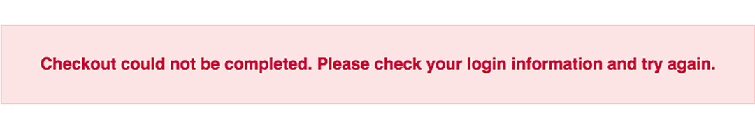
This is what we start out with, by default, after adding the HTML:

Customizing a basic error message is really simple. All we have to do is give our text a colored background and a couple font styles using CSS. To style the error message background, add the following styles to your CSS stylesheet:
.error-message {
  background-color: #fce4e4;
  border: 1px solid #fcc2c3;
  float: left;
  padding: 20px 30px;
}
Now let’s style the text itself by adding the following font styles:
.error-text {
  color: #cc0033;
  font-family: Helvetica, Arial, sans-serif;
  font-size: 13px;
  font-weight: bold;
  line-height: 20px;
  text-shadow: 1px 1px rgba(250,250,250,.3);
}
That’s it! Keep reading to learn how to style input field and tooltip errors.
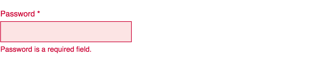
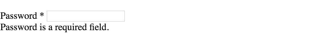
Input Field Error
Now that we have our basic error message styled, let’s work on input field errors. This is what the final product will look like:
And this is what we start out with by default:
First, we want to override the browser’s default styles. Add the following CSS to give your input field a custom look:
/* Basic Input Styling */
.input-group {
  color: #333;
  float: left;
  font-family: Helvetica, Arial, sans-serif;
  font-size: 13px;
  line-height: 20px;
  margin: 0 20px 10px;
  width: 200px;
}

label {
  display: block;
  margin-bottom: 2px;
}

input[type=text] {
  background: #fff;
  border: 1px solid #999;
  float: left;
  font-size: 13px;
  height: 33px;
  margin: 0;
  padding: 0 0 0 15px;
  width: 100%;
}
Next, we need to add the styling for the error message that displays when a user does not correctly fill out an input field (i.e. the “This is a required field” message):
.error-message {
  color: #cc0033;
  display: inline-block;
  font-size: 12px;
  line-height: 15px;
  margin: 5px 0 0;
}
Lastly, add the error-specific styling for the input field elements:
.error label {
  color: #cc0033;
}

.error input[type=text] {
  background-color: #fce4e4;
  border: 1px solid #cc0033;
  outline: none;
}
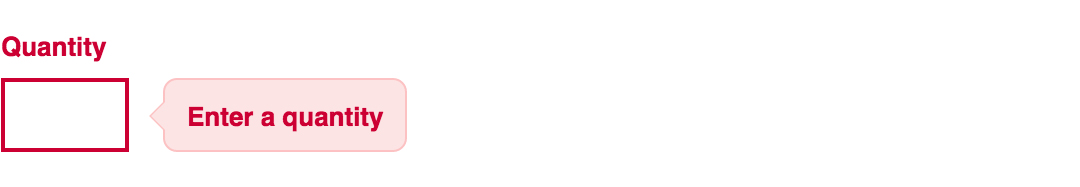
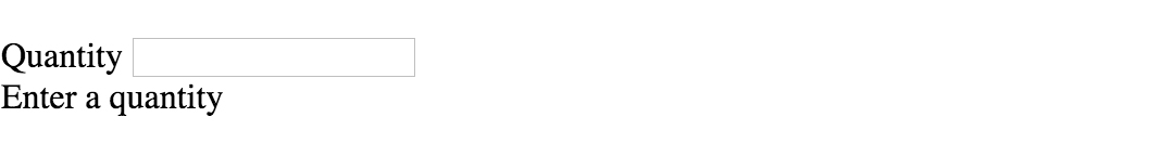
Input Field Error with Tooltip
The last element we’re tackling is the tooltip. It is slightly more complicated than the others but well worth the effort. We will also be utilizing Sass nesting to better organize our code, and because we are only using SCSS it is 100% editable and scalable.
Once we are done, the tooltip will look like this:
And by default, this is what we start with after adding the HTML:
First, we override the browser’s default styles with our own custom styling:
/* Basic Input Styling */
.input-group {
  color: #333;
  float: left;
  font-family: Helvetica, Arial, sans-serif;
  font-size: 13px;
  line-height: 20px;
  margin-bottom: 10px;
  width: 100%;
}

label {
  display: block;
  margin-bottom: 5px;
}

input[type=text] {
  background: #fff;
  border: 1px solid #ccc;
  color: #333;
  float: left;
  font-family: Helvetica, Arial, sans-serif;
  font-size: 13px;
  height: 33px;
  line-height: 20px;
  margin: 0;
  padding: 0 0 0 15px;
  width: 45px;
}
Just like our previous example, we need to add the tooltip error message styling that displays when a form error occurs. Note: we are using Sass here to nest the tooltip’s left arrow properties. This comes in handy when trying to keep track of which values are assigned to the tooltip specifically:
/* Tooltip Styling */
.error-tip {
  background-color: #fce4e4;
  border: 1px solid #fcc2c3;
  border-radius: 7px;
  -moz-border-radius: 7px;
  -webkit-border-radius: 7px;
  display: inline;
  color: #cc0033;
  float: left;
  font-weight: bold;
  line-height: 24px;
  position: relative;
  padding: 7px 11px 4px;
  margin-left: 17px;
  // Left Arrow Styling Starts Here
  &:after, &:before {
    content: '';
    border: 7px solid transparent;
    position: absolute;
    top: 11px;
  }
  &:after {
    border-right: 7px solid #fce4e4;
    left: -14px;
  }
  &:before {
    border-right: 7px solid #fcc2c3;
    left: -15px;
  }
} // end .error-tip
Now all that’s left to do is define the input’s error-specific styling. Again, we will nest these styles under an “error” class selector to make classification and future changes easier:
/* Error Styling */
.error.input-group {
  label {
    color: #cc0033;
    font-weight: bold;
  }
  input {
    border: 2px solid #cc0033;
    line-height: 37px;
    outline: none;
  }
  .status {
    display: none;
  }
  .error-tip {
    display: inline;
  }
} // end .error
And that’s it! All the code you need to customize error messaging for default form elements. To experiment with the final results and copy and paste to your heart’s content (without fear of breaking anything), jump on over to Codepen by selecting any of the tutorial links below.
Codepen/Tutorial Links
All: codepen.io/seskew/
Basic Error Message: codepen.io/seskew/pen/akhLx
Input Field Error: codepen.io/seskew/pen/XKJKNQ
Input Field Error with Tooltip: codepen.io/seskew/pen/NrPNBp
Error, success, warning and info messages/alerts made entirely with CSS. These messages should be output to the user to let them know how things are going with their interaction with the site. Also please note that these use Font Awesome.
See the Pen Error, Success, Warning and Info Messages by Alex Dobson (@SufferMyJoy) on CodePen.0
HTML
CSS
If you are already using Font Awesome, then you can delete the first line of this CSS that imports it.
As always thank you for reading and please share it around as much as you can! Please feel free to put any suggestions or ideas for future tutorials in the comments section below.
- Главная»
- Уроки»
- CSS»
- Создание красивых сообщений с помощью CSS
- Метки урока:
- подсказки
- сообщения
В данном уроке Вы научитесь создавать красивые сообщения с помощью CSS. Кроме этого, Вы также узнаете как ими правильно пользоваться.


Давайте начнем с типов сообщений
1. Информационные сообщения
Цель этих сообщений информирования пользователя. Такие сообщения должны быть голубыми, так как люди ассоциируют этот цвет с информацией. Это может быть любая информация, которая может быть полезна юзеру.

2. Сообщения об успехе
Сообщения об успехе должны быть показаны после того, как юзер успешно выполнил какую-либо операцию. Успешно — означает полностью и без ошибок. Обычно такие сообщения зеленого цвета.

3. Сообщения-предупреждения
Подобные сообщения должны быть показаны пользователю если операция не может быть завершена. Обычно они желтого цвета.

4. Сообщения об ошибке
Сообщения об ошибке должны быть показаны только в том случае, если операцию невозможно выполнить. Красный идеальный цвет для этого, так как многие ассоциируют этот цвет с тревогой 

5. Сообщения проверки
Еще один тип сообщений. Я предпочел для них оранжевый цвет. Подобные сообщения показывают пользователю его ошибки (например, при заполнении форм).

Теперь давайте посмотрим как такие сообщения создать
Нам понадобится следующий код CSS:
body{
font-family:Arial, Helvetica, sans-serif;
font-size:13px;
}
.info, .success, .warning, .error, .validation {
border: 1px solid;
margin: 10px 0px;
padding:15px 10px 15px 50px;
background-repeat: no-repeat;
background-position: 10px center;
}
.info {
color: #00529B;
background-color: #BDE5F8;
background-image: url('info.png');
}
.success {
color: #4F8A10;
background-color: #DFF2BF;
background-image:url('success.png');
}
.warning {
color: #9F6000;
background-color: #FEEFB3;
background-image: url('warning.png');
}
.error {
color: #D8000C;
background-color: #FFBABA;
background-image: url('error.png');
}
.validation {
color: #D63301;
background-color: #FFCCBA;
background-image: url('validation.png');
}
Данный код можно вставить как в тот же файл, так и вынести в таблицу стилей.
Теперь нам достаточно в теле документа создать слой с необходимым классом:
<div class="info">Info message</div>
<div class="success">Successful operation message</div>
<div class="warning">Warning message</div>
<div class="error">Error message</div>
<div class="validation">Validation message</div>
Заключение
Сообщения очень важный элемент любого интерфейса. Очень часто их вообще не используют. Не повторяйте эту ошибку и пользуйтесь подобными сообщениями! И желаю Вашим пользователям как можно меньше сообщений об ошибках!!!
5 последних уроков рубрики «CSS»
-

Забавные эффекты для букв
Небольшой эффект с интерактивной анимацией букв.
-
Реализация забавных подсказок
Небольшой концепт забавных подсказок, которые реализованы на SVG и anime.js. Помимо особого стиля в примере реализована анимация и трансформация графических объектов.
-
Анимированные буквы
Эксперимент: анимированные SVG буквы на базе библиотеки anime.js.
-
Солнцезащитные очки от первого лица
Прикольный эксперимент веб страницы отображение которой осуществляется “от первого лица” через солнцезащитные очки.
-
Раскрывающаяся навигация
Экспериментальный скрипт раскрывающейся навигации.


A message box is one of the informative components on a webpage. It displays on various events like success or failure of a process. These messages are really important in regards to interactive web design. In this tutorial, we are going to style an error message with the CSS code example.
Here, you’ll find not only an error message but also info, warning, and success message box design. Because of the CSS style quite similar for these type of messages except minor changes of color and icon. You can check out the final output on the demo page.
The coding concept is for this type of message boxes is clean and easy. You just need to wrap your message text in only a div tag with a specific class name. Then we’ll style these message boxes with CSS.
HTML Structure
The HTML is as simple as one line of code. You just need to wrap your “error message” in a div tag with the class name "error". You can add any further elements inside this tag. Therefore, a basic HTML for an error message is as follows:
<div class="error">Error message</div>
Additionally, you can also create the message boxes for info, success, warning, and validation with the same method mentioned above. Just add a relevant class name to your message that we’ll style in CSS.
<div class="info">
   Info message
</div>
<div class="success">
   Successful operation message
</div>
<div class="warning">
   Warning message
</div>
<div class="validation">
   Validation message 1 <br>
   Validation message 2
</div>
You are not limited to add only plain text inside your message box element. You can also add any HTML elements such as images, buttons, links, or HTML5 videos. However, you’ll need to style these elements with additional CSS.
First of all, define the common CSS for all types of messages. If you just need only an error message style, then simply erase the other class selector from the below code:
.info,
.success,
.warning,
.error,
.validation {
	border: 1px solid;
	margin: 10px auto;
	padding: 15px 10px 15px 50px;
	background-repeat: no-repeat;
	background-position: 10px center;
	max-width: 460px;
}
After that, create styles for an error message by targeting the "error" class. Define it’s color (for text), background color, and set error icon using CSS background-image property.
.error {
	color: #D8000C;
	background-color: #FFBABA;
	background-image: url('https://i.imgur.com/GnyDvKN.png');
}
You can also add Font Awesome icon if you don’t want to add an image icon. To do so, include the Font Awesome CSS library into your project and add the specific icon by targeting the “.error:before” pseudo-selector. The following is an example of the use of the Font Awesome icon.
.error:before{
   font-family: FontAwesome;
   content: '\f057';
   font-size: 24px;
   color: #D8000C;
}
Similarly, create CSS styles for validation message as follows:
.validation {
	color: #D63301;
	background-color: #FFCCBA;
	background-image: url('https://i.imgur.com/GnyDvKN.png');
}
You may also need to style a “warning message” box to the attention of the users.
.warning {
	color: #9F6000;
	background-color: #FEEFB3;
	background-image: url('https://i.imgur.com/Z8q7ww7.png');
}
Likewise, create CSS styles for info and success messages described as follows:
.info {
	color: #00529B;
	background-color: #BDE5F8;
	background-image: url('https://i.imgur.com/ilgqWuX.png');
}

.success {
	color: #4F8A10;
	background-color: #DFF2BF;
	background-image: url('https://i.imgur.com/Q9BGTuy.png');
}
That’s all! I hope you find this tutorial helpful to create an error message and successfully implement this CSS style example. If you need any further help in regards to CSS styling, let me know by comment below.